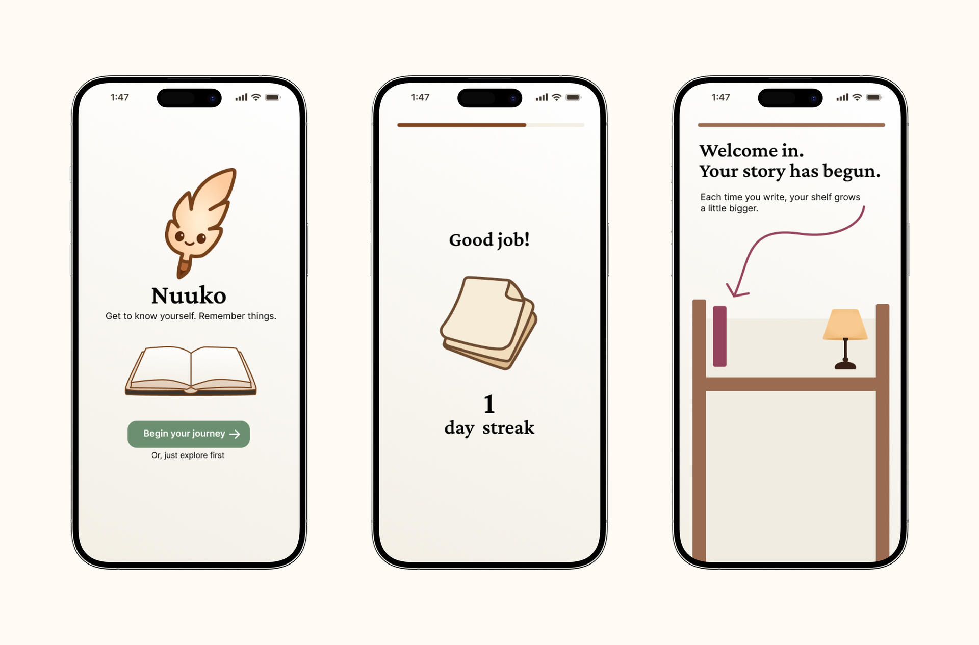
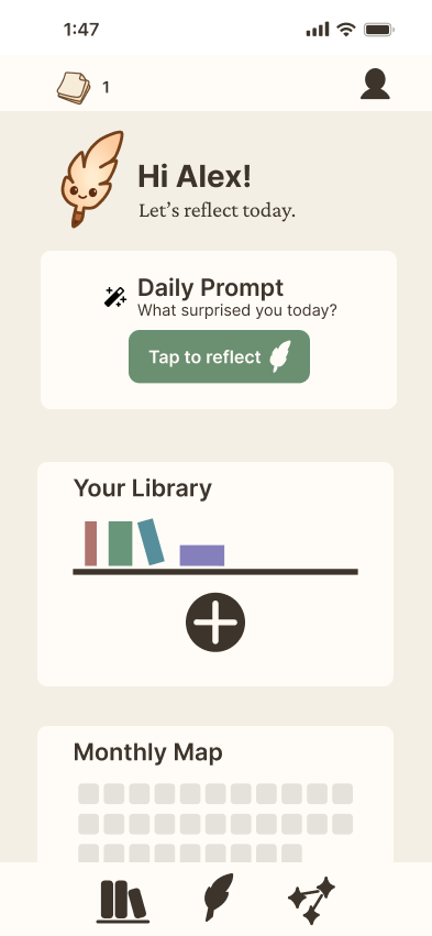
nuuko 
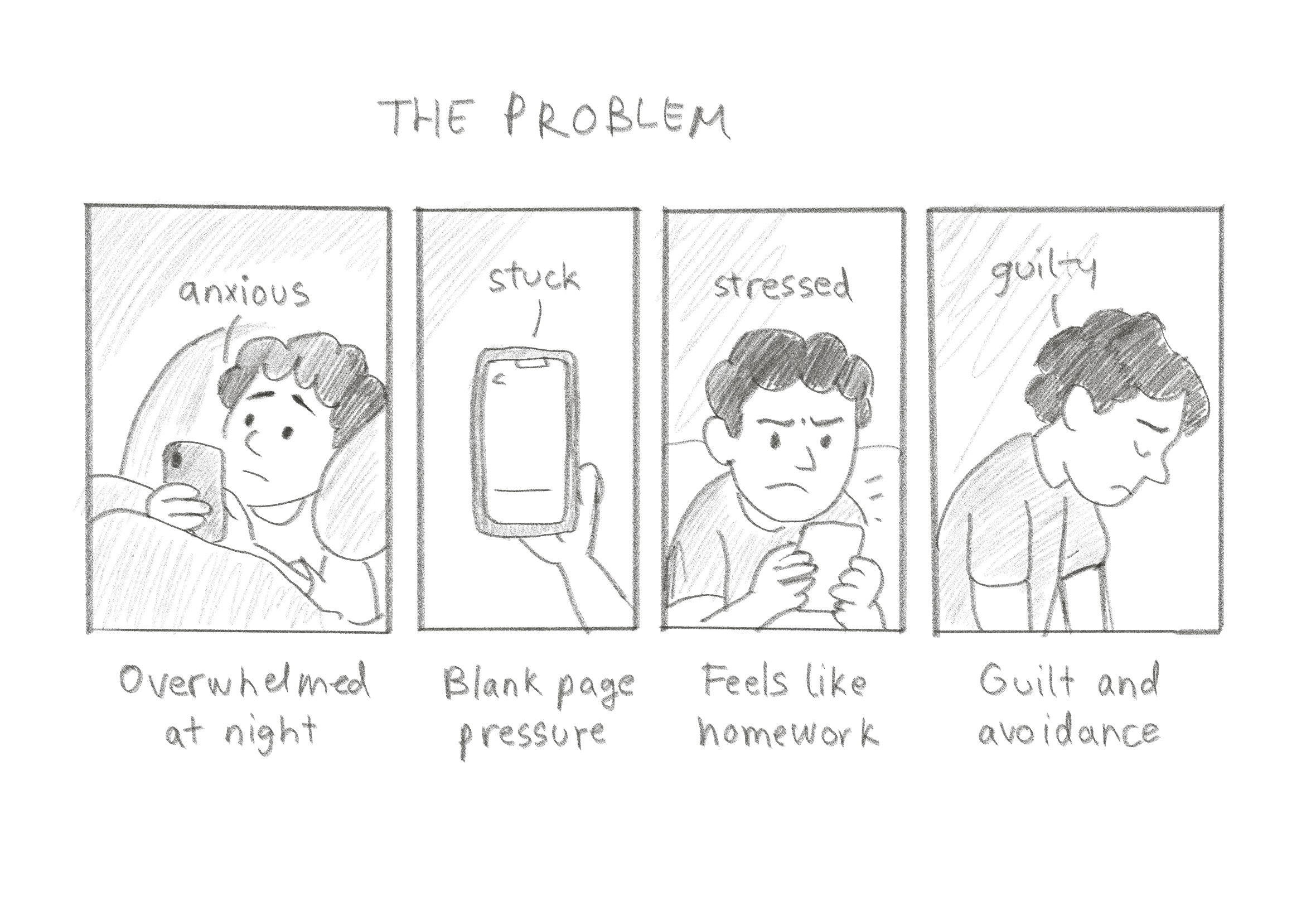
designing a journaling app that doesn't make you feel terrible
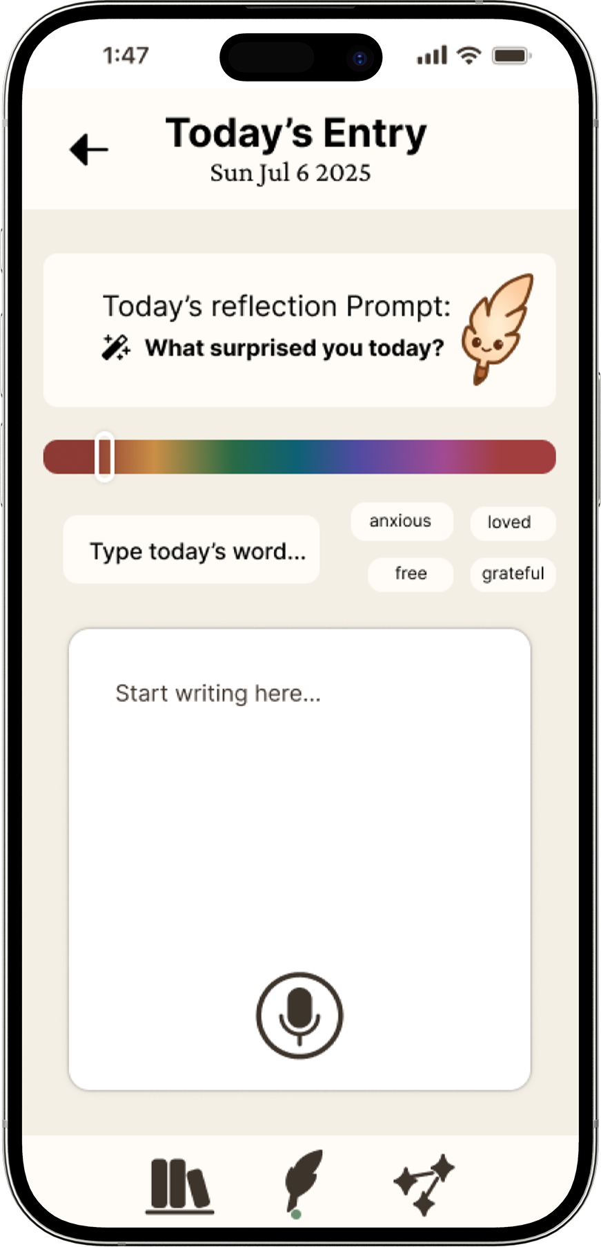
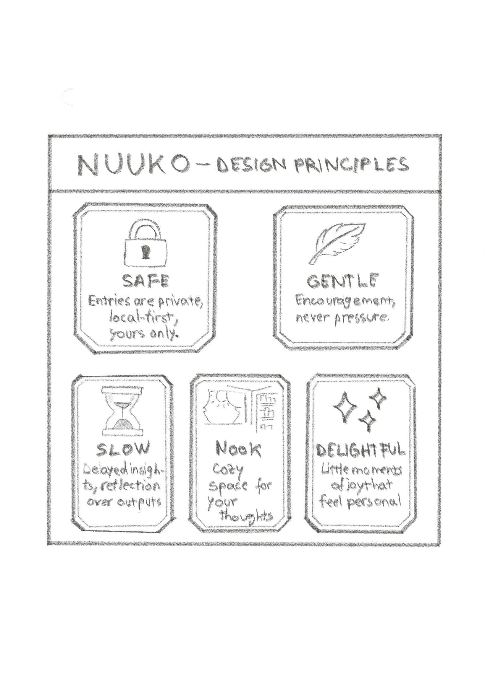
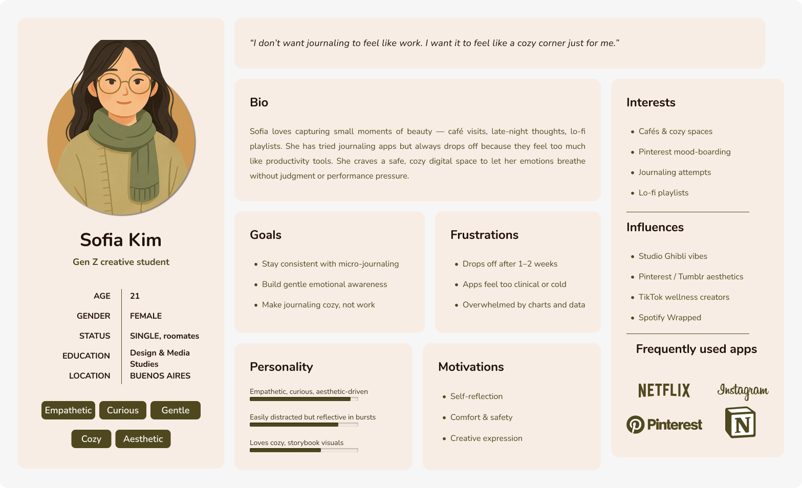
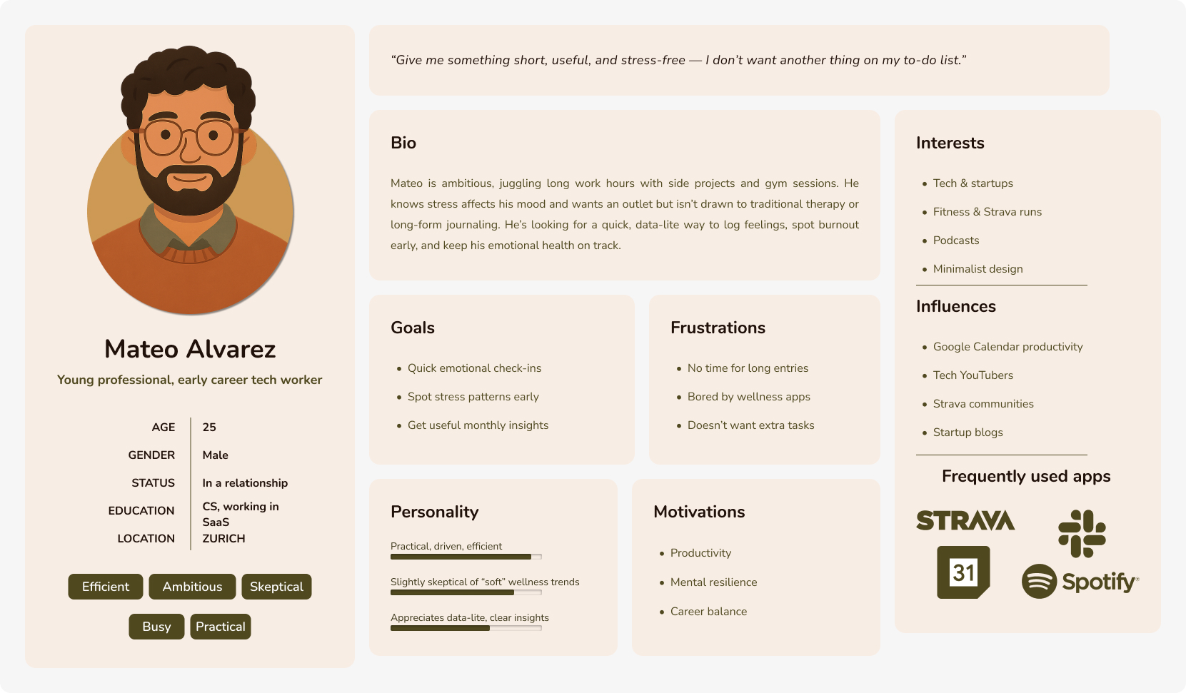
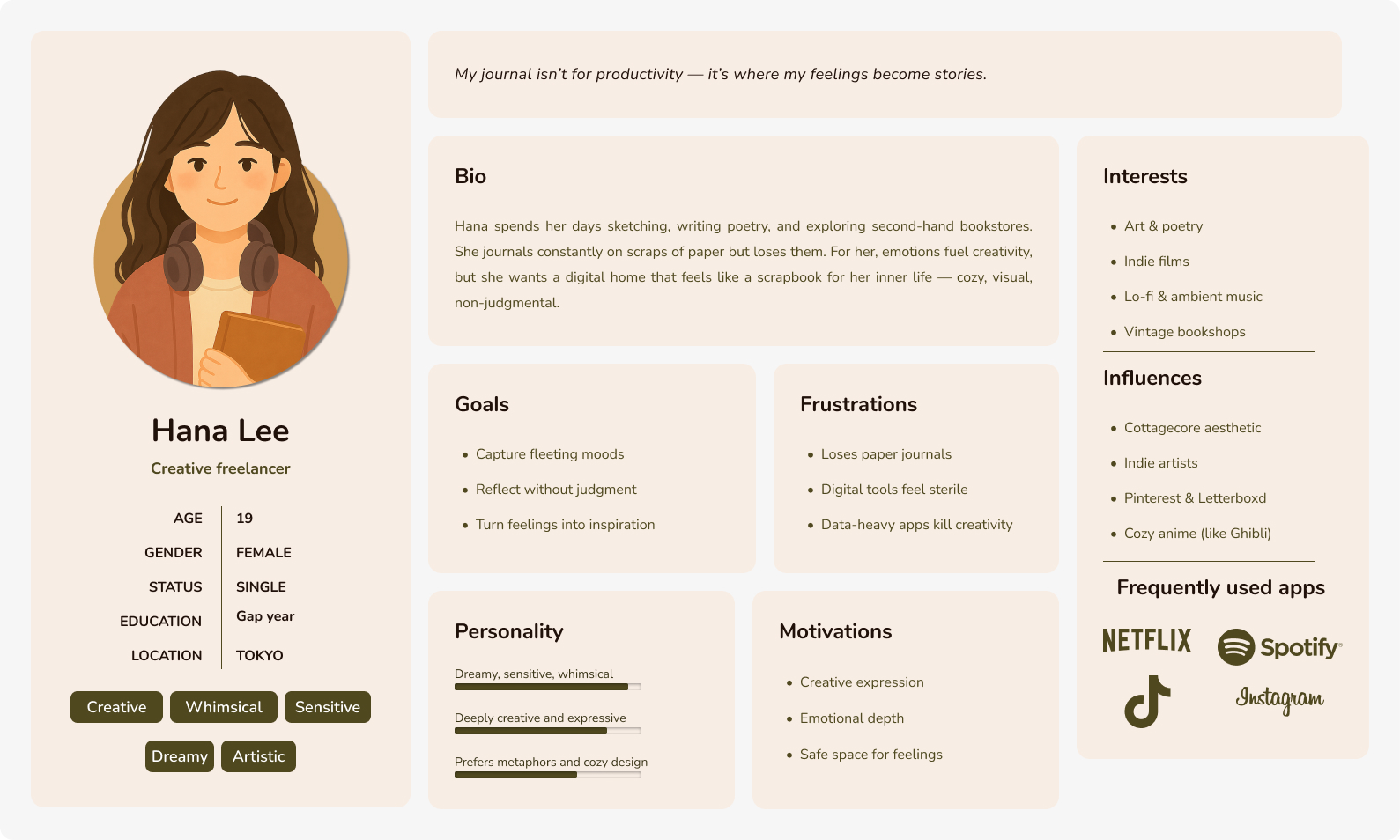
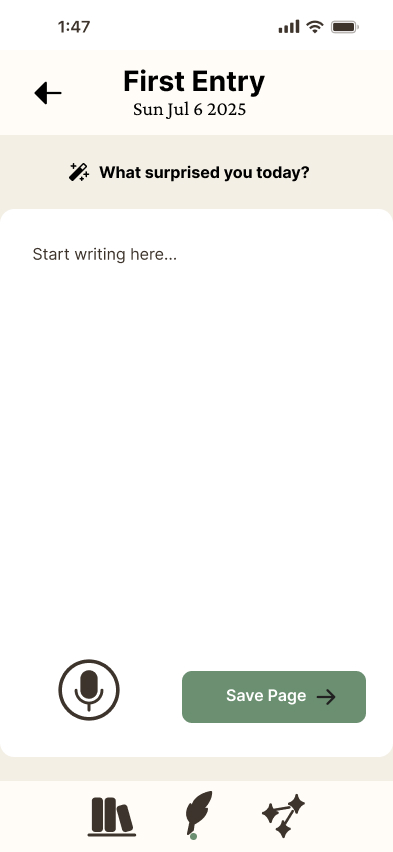
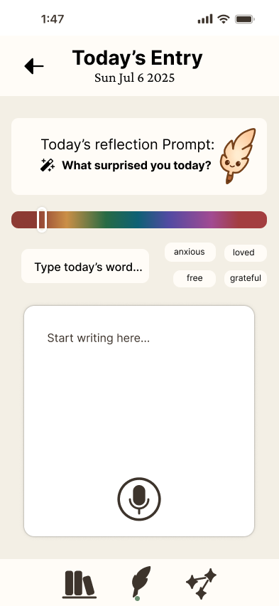
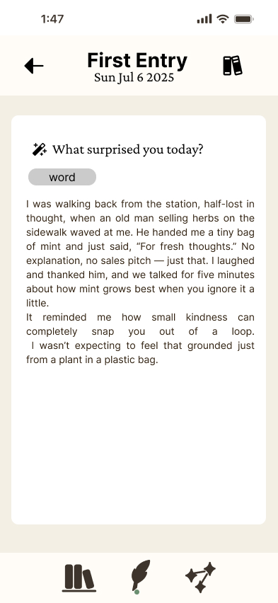
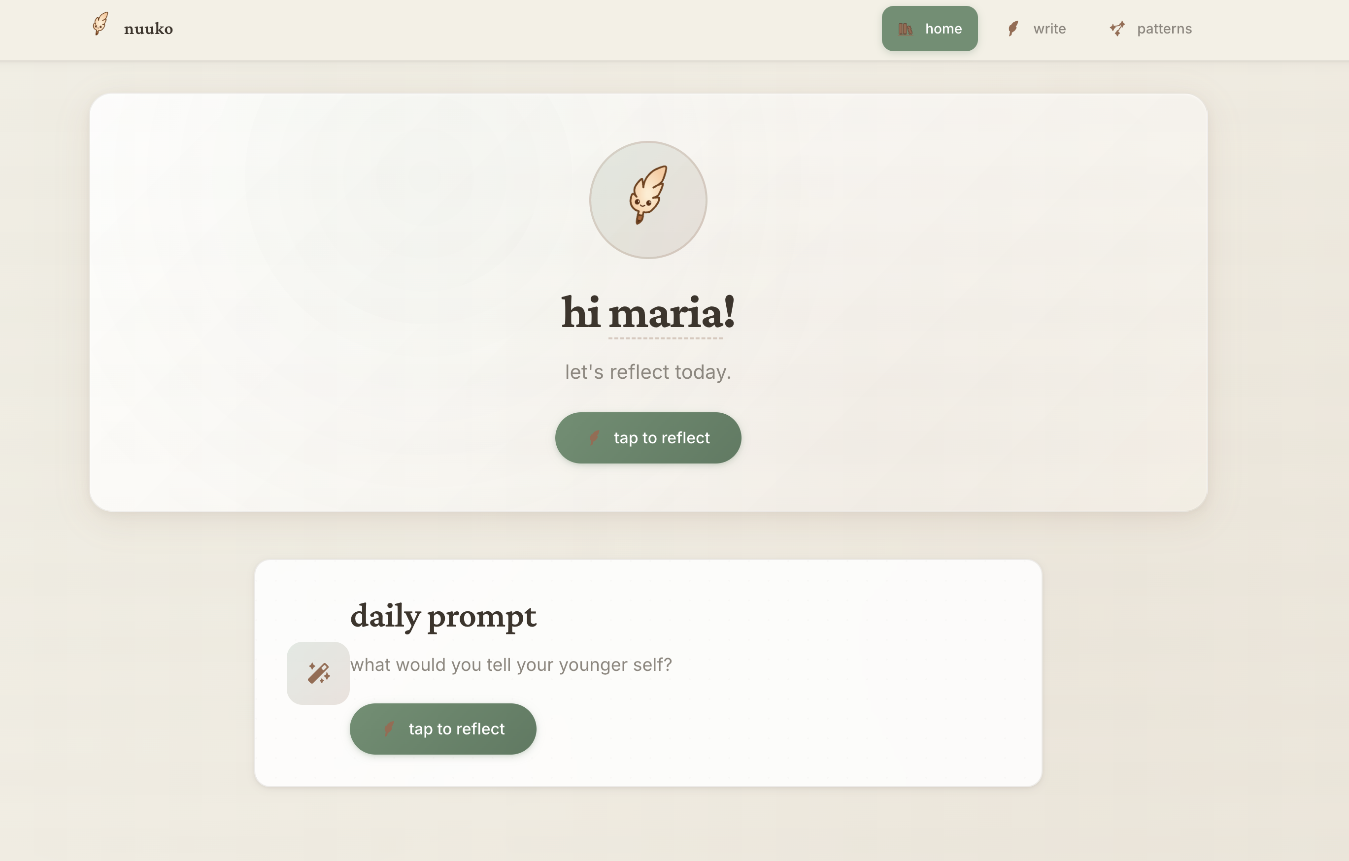
Emotion-first design
Privacy by design
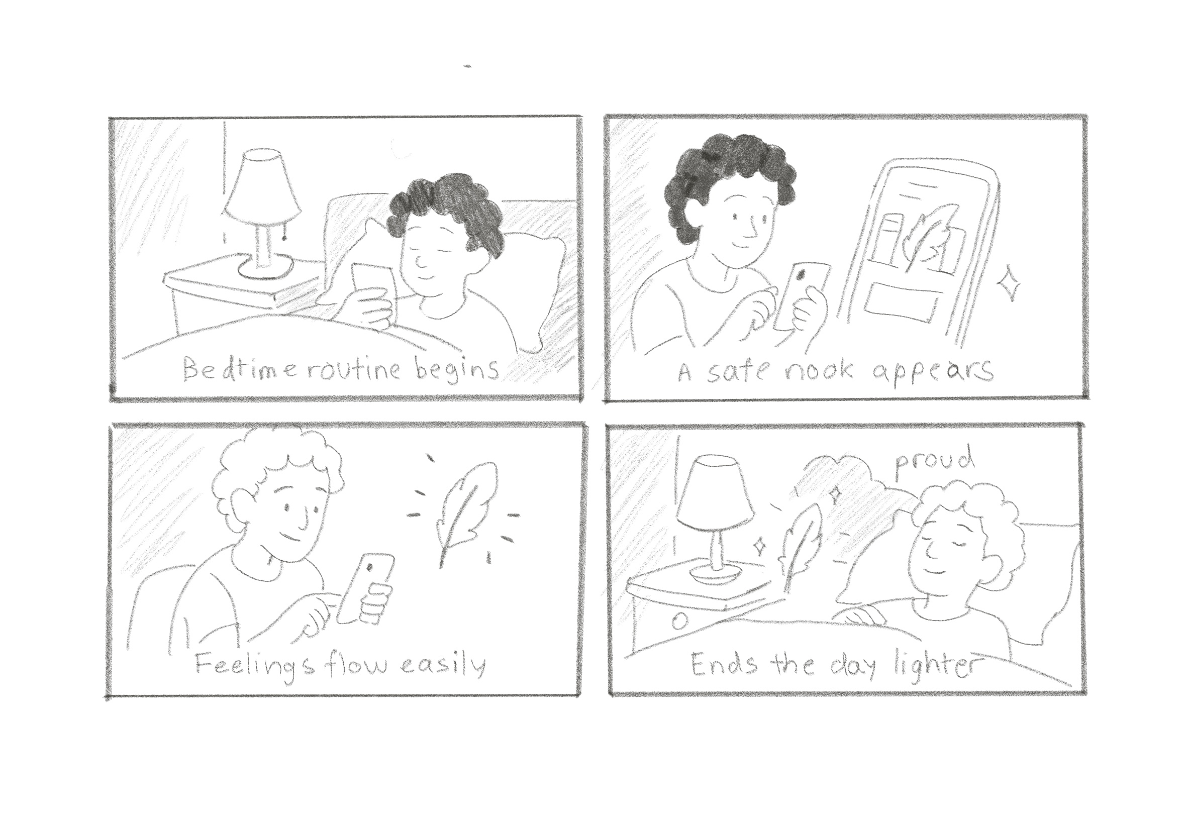
Gentle guidance
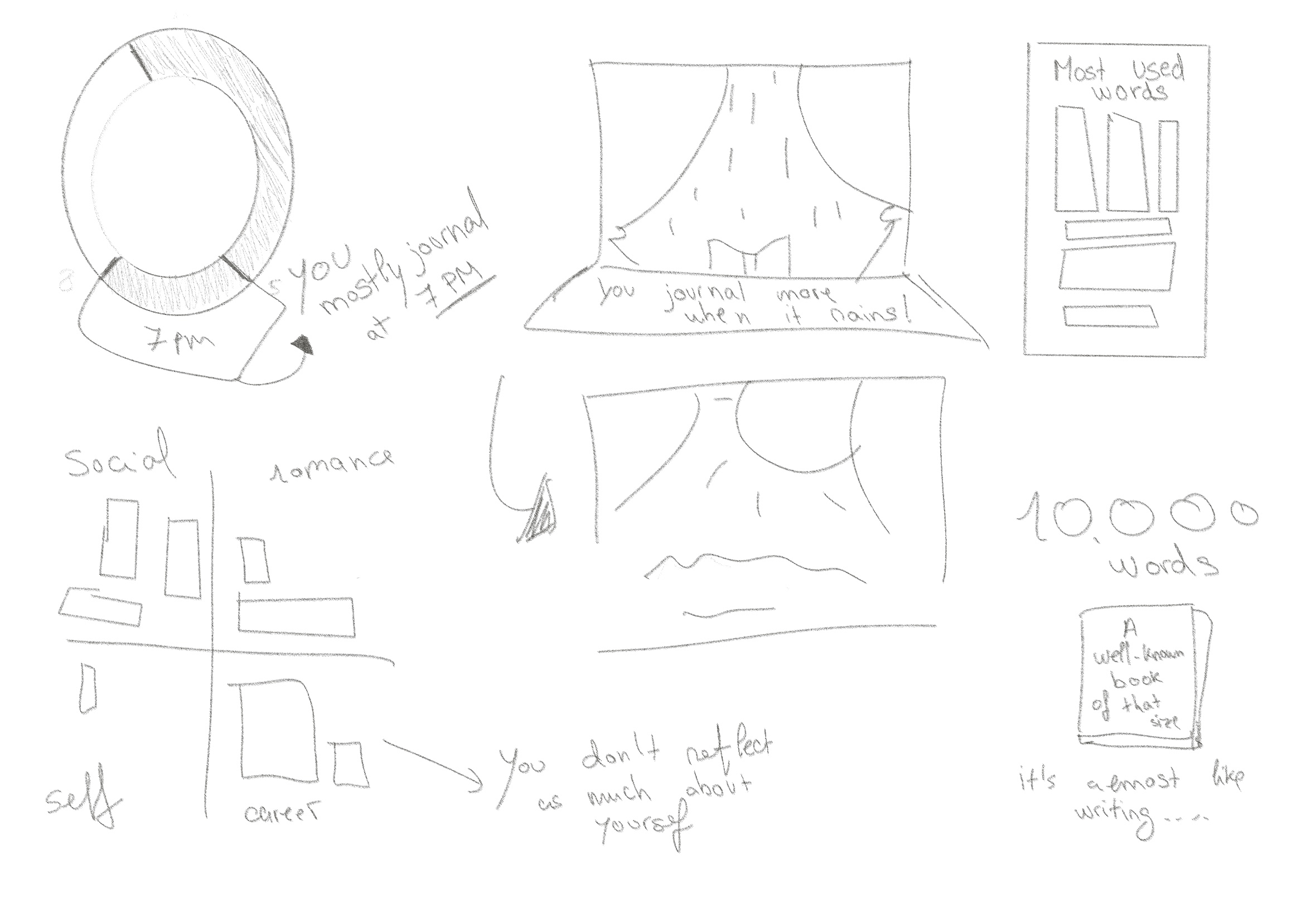
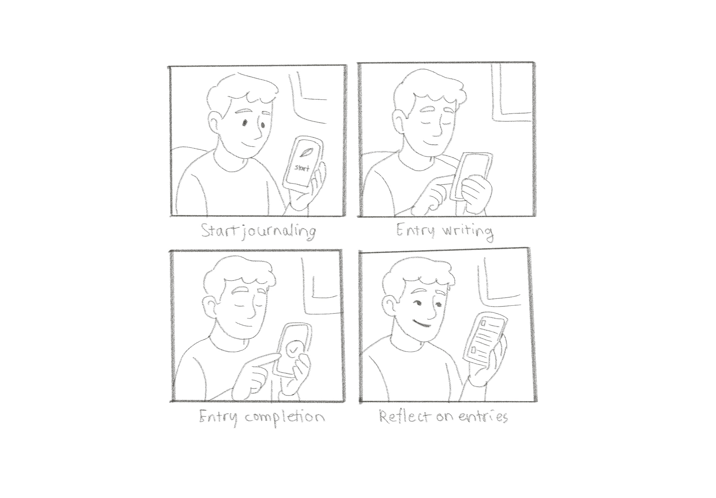
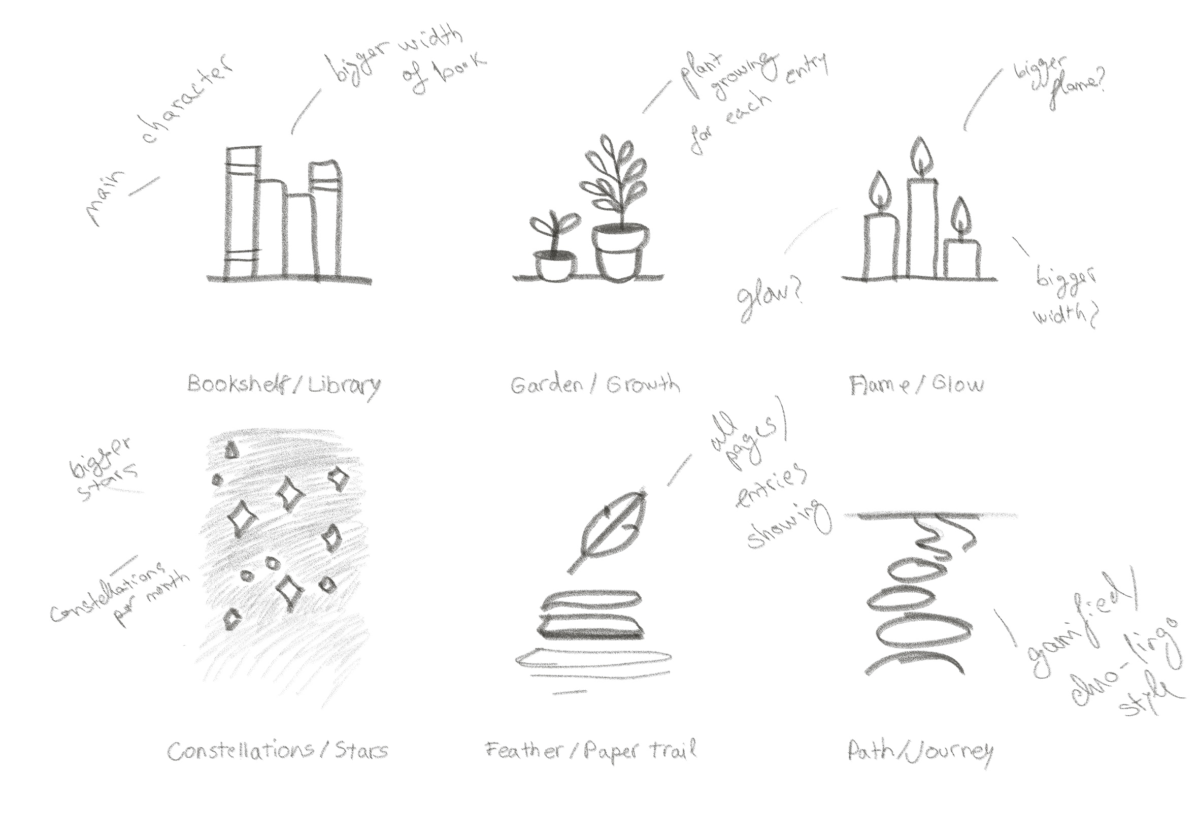
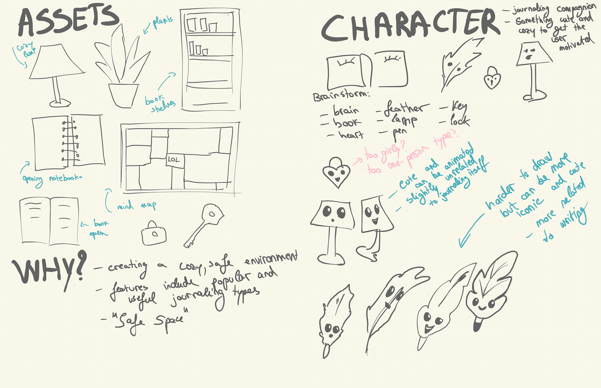
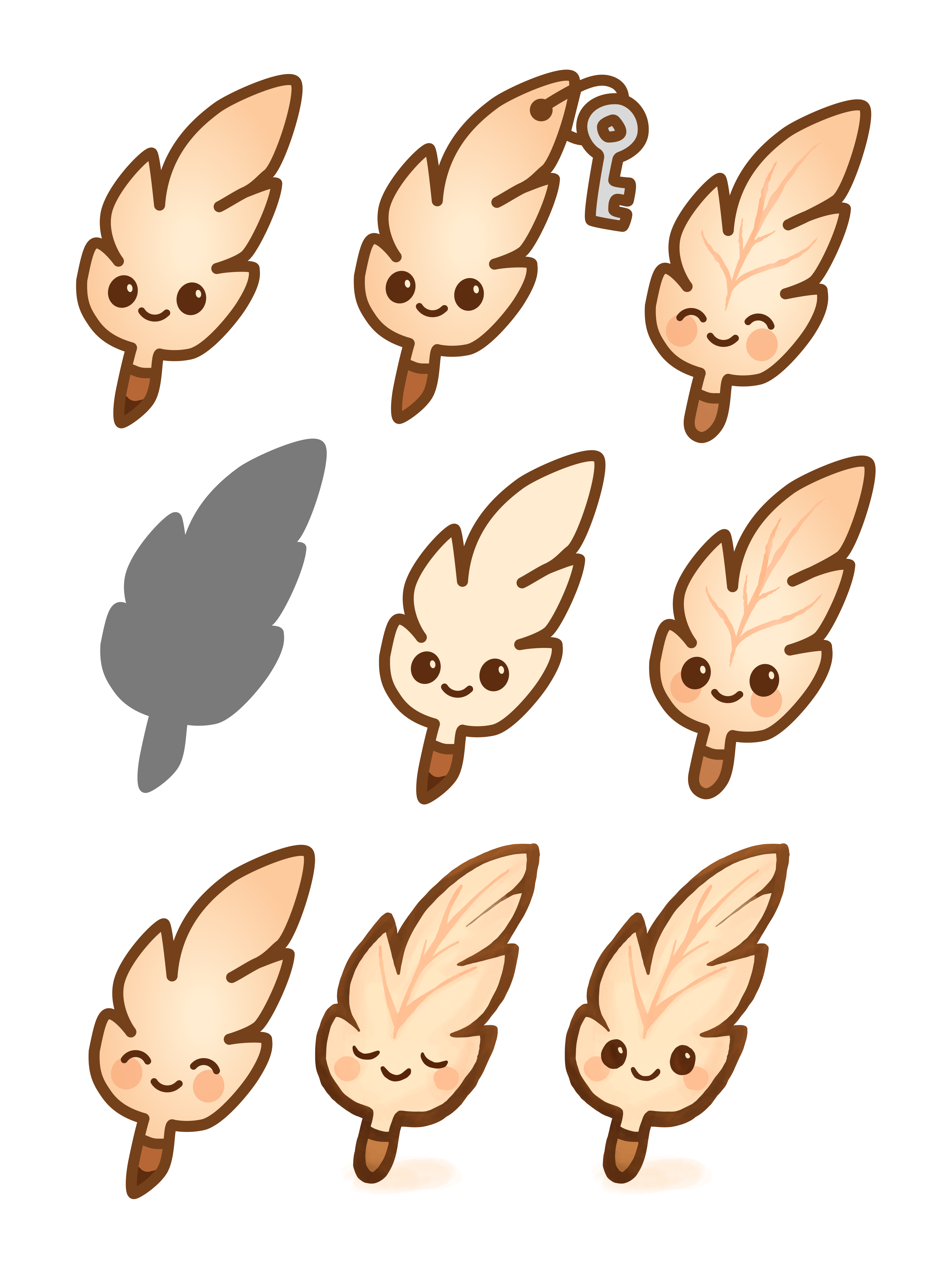
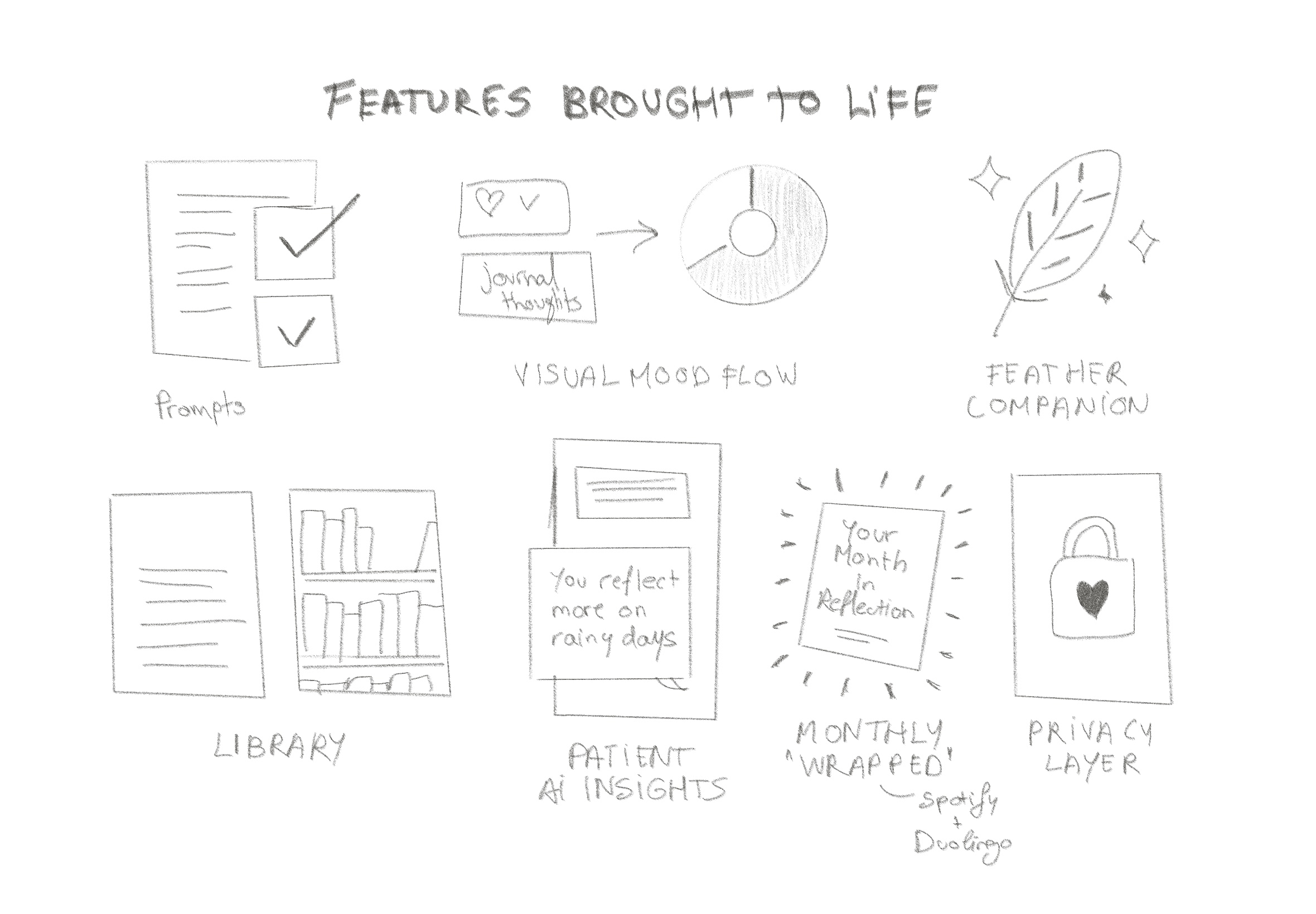
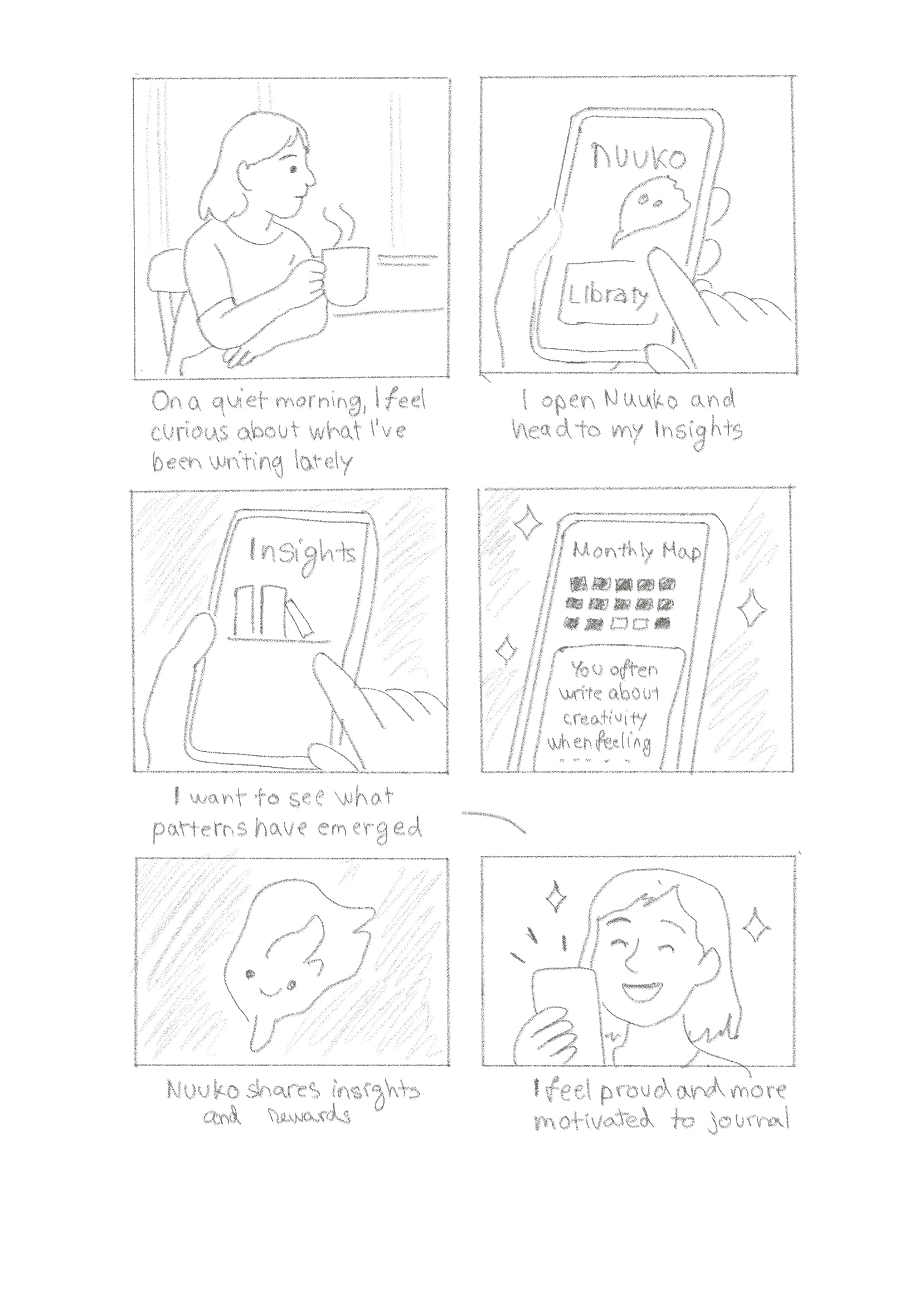
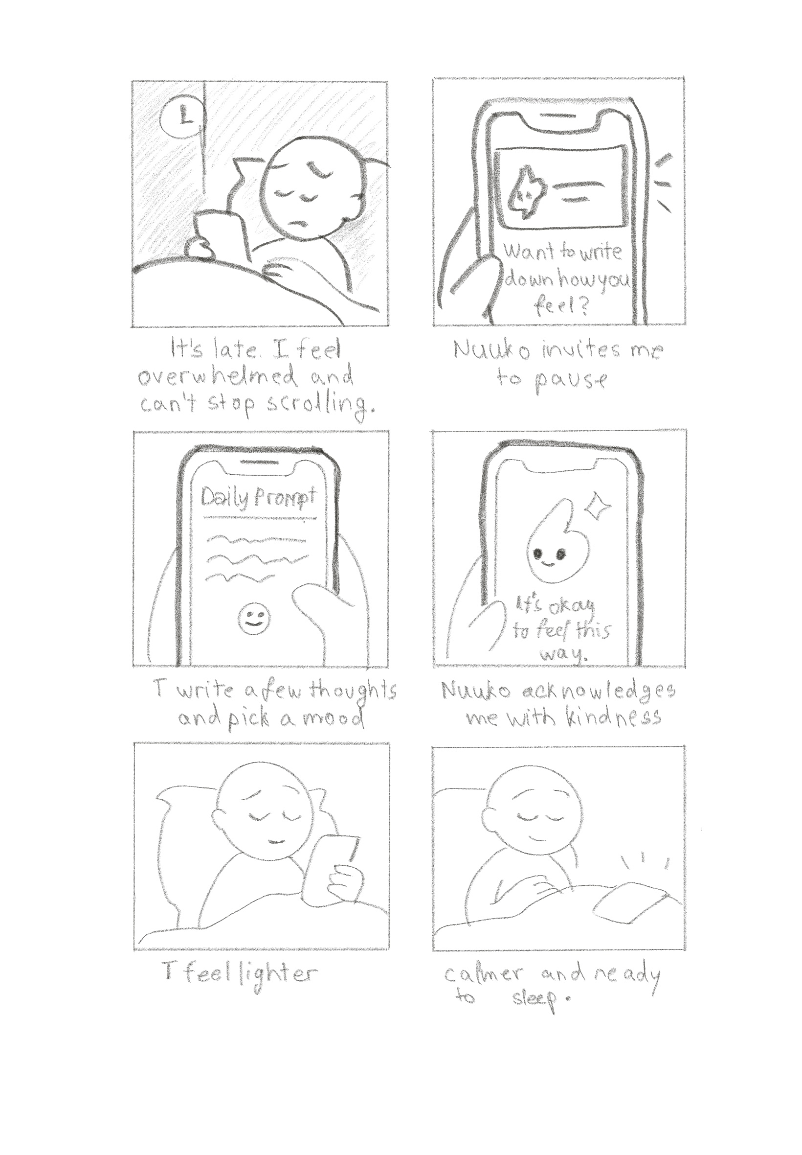
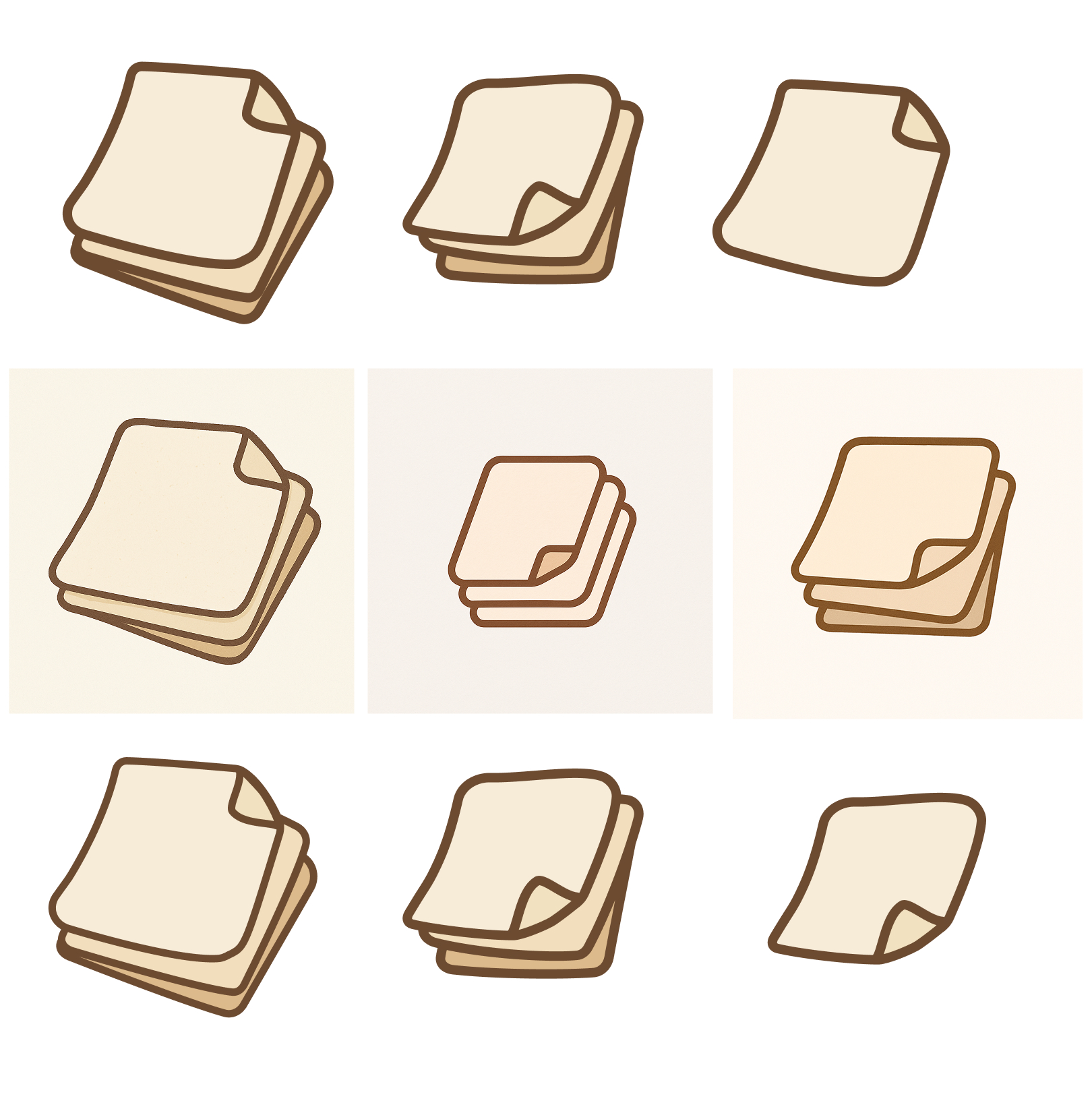
"Since journaling has always been a paper experience, I deliberately chose to do most of my design exploration on paper to stay connected to the authentic, tactile nature of journaling."
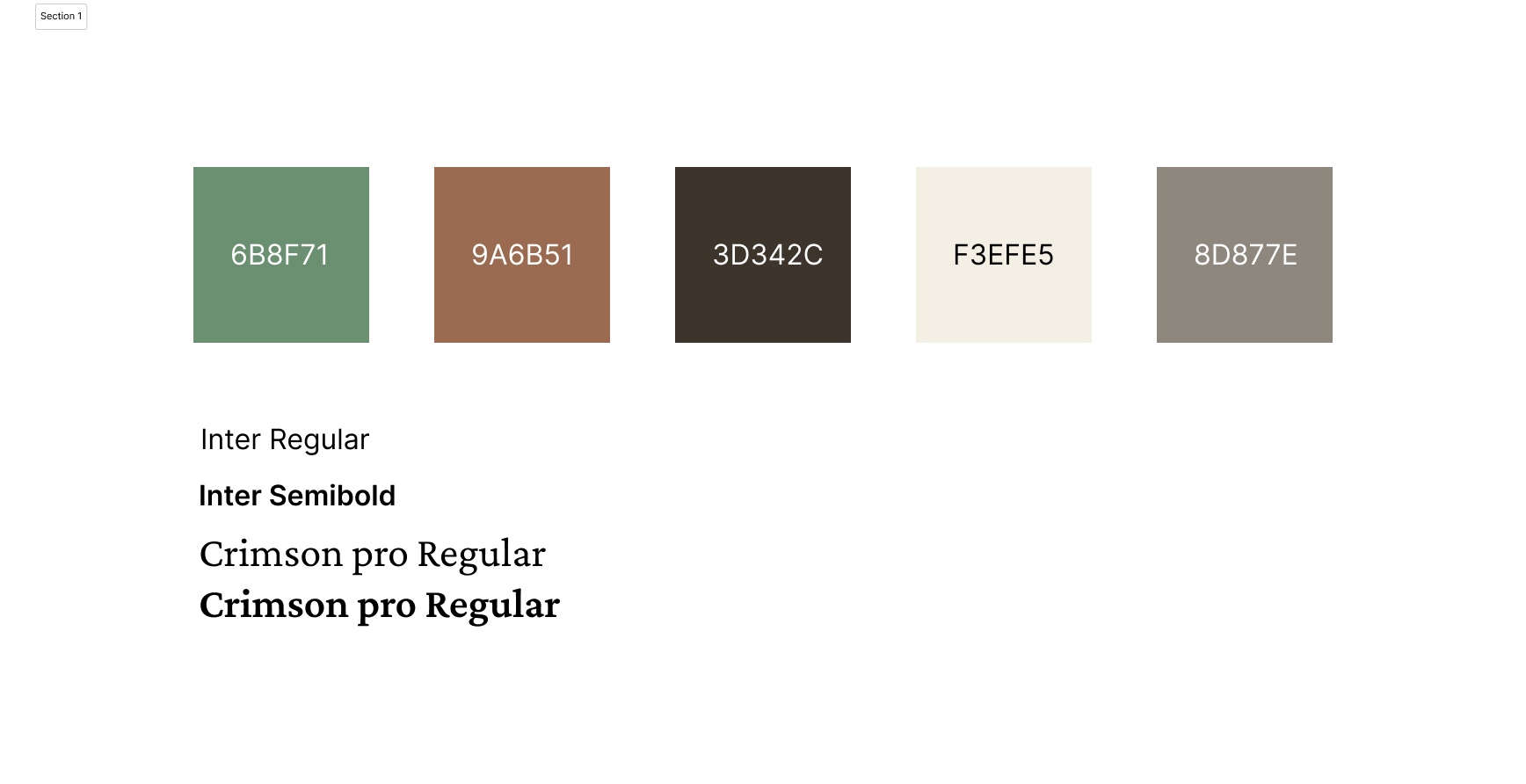
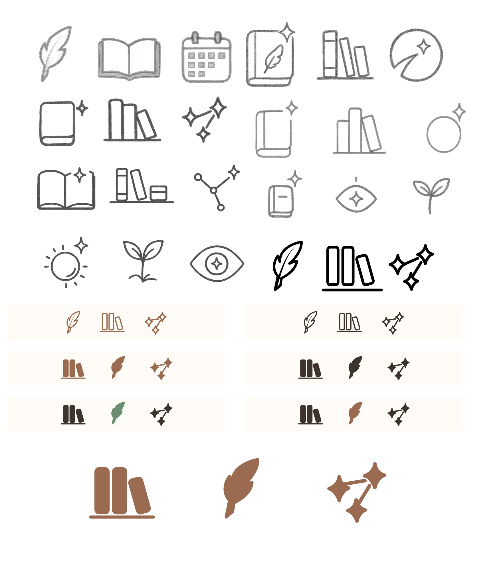
Color Palette

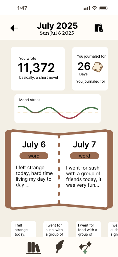
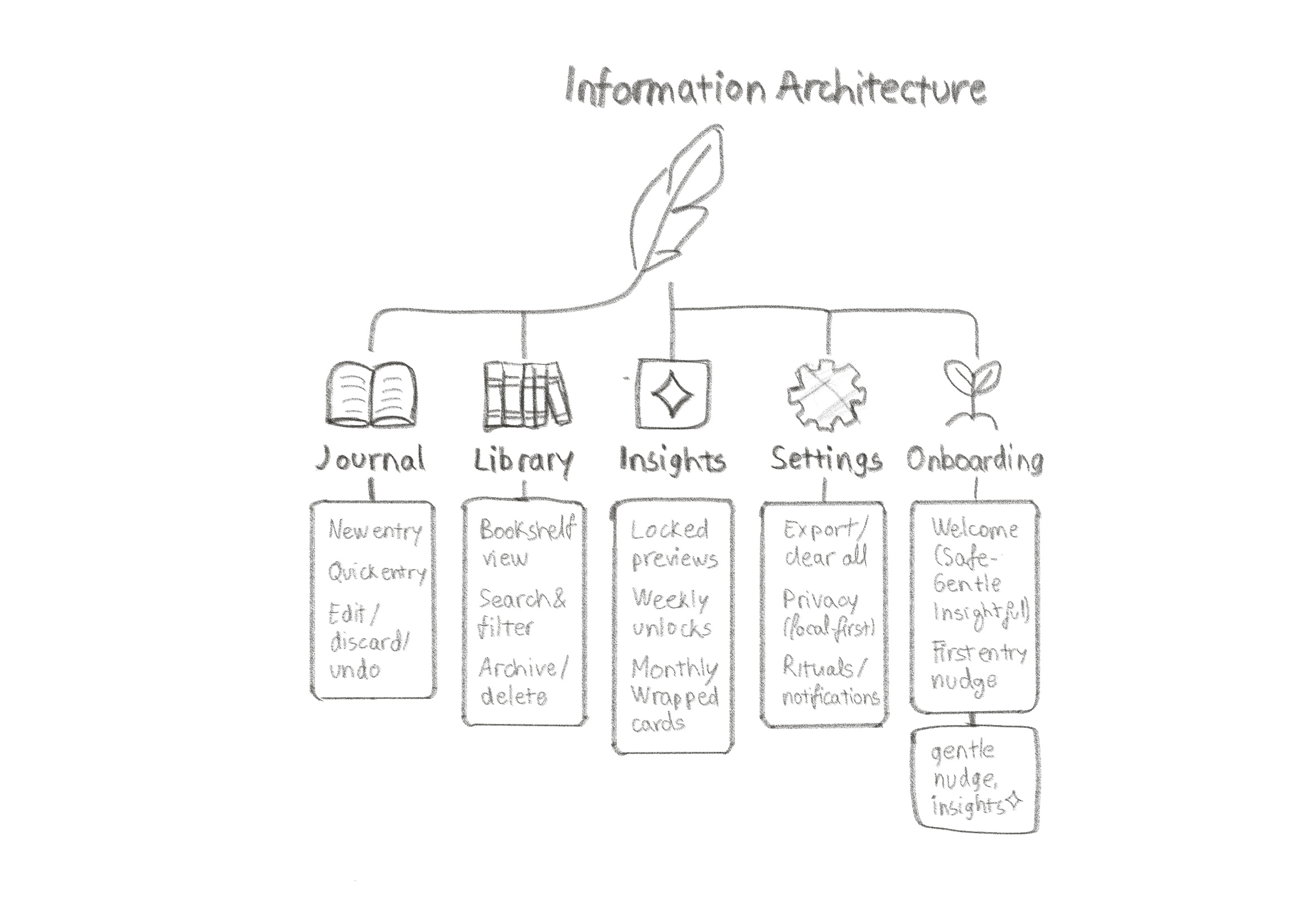
.png)
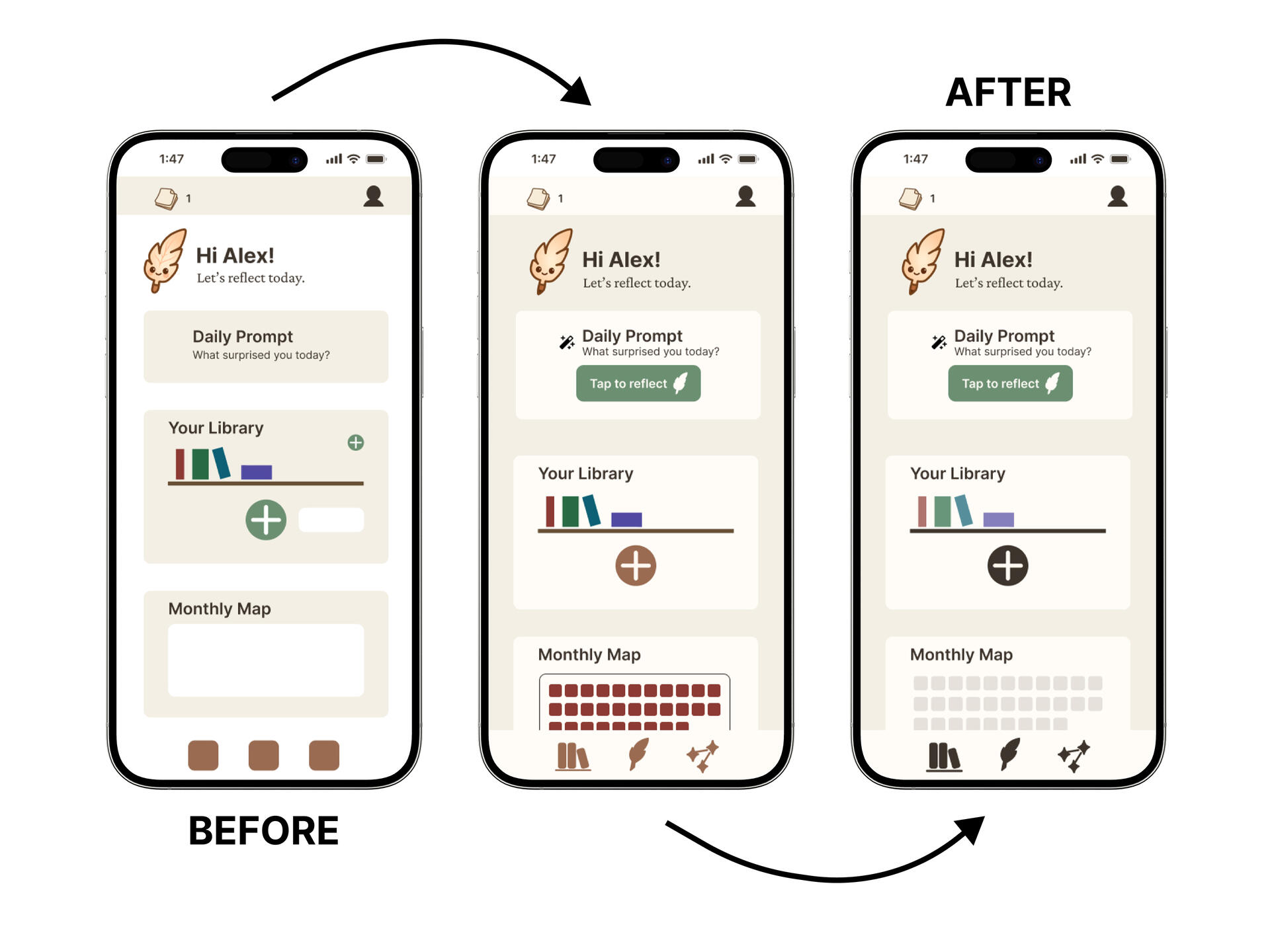
.png)
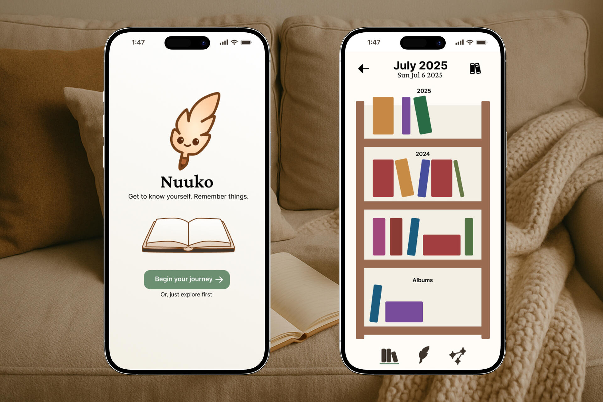
.png)
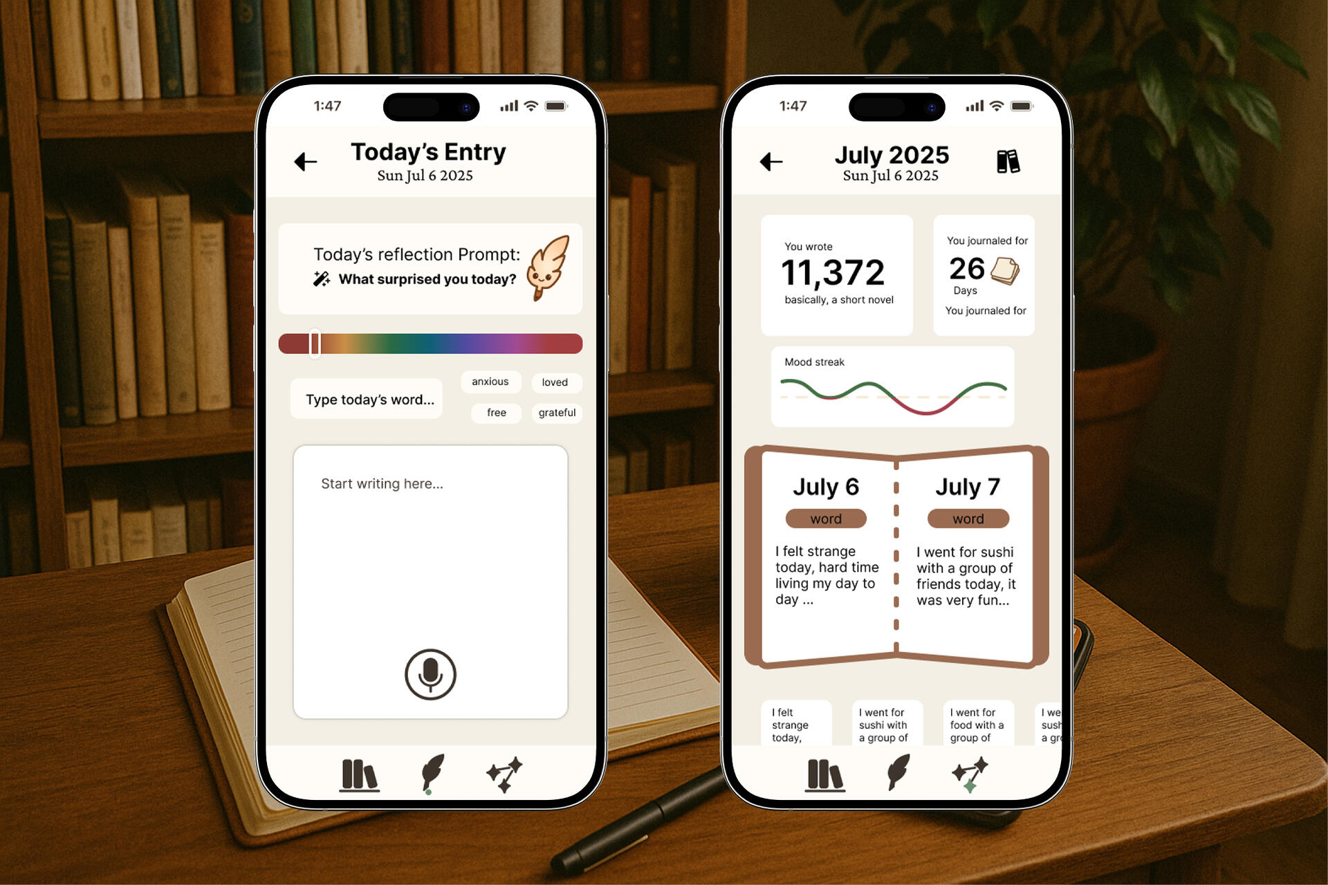
.png)
.png)
.png)