Data Visualization · Product Design · Revolut Task

clearly.

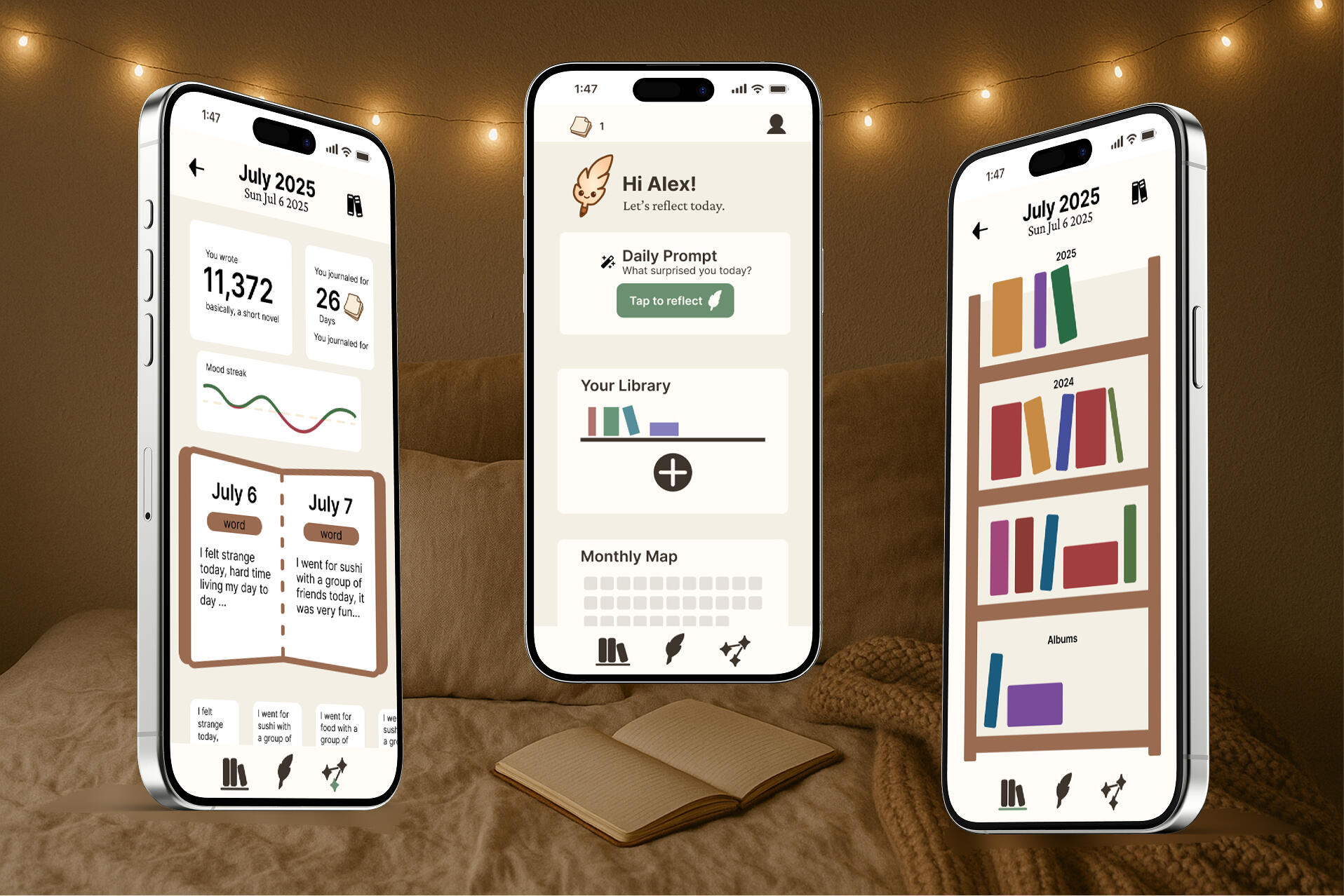
designing a data experience where charts explain themselves — and non-analysts go from confused to confident

Data Visualization UX Research Information Design Design Systems
Project
Clearly — Data Viz App
Context
Revolut Design Task
Role
Product Designer (solo)
Year
2026
Palette

"Most data tools speak in charts. Clearly speaks in questions — guiding you from raw numbers to real understanding, one curious conversation at a time."

Problem Research Design System Solution Full Deck Reflection
Clearly cover

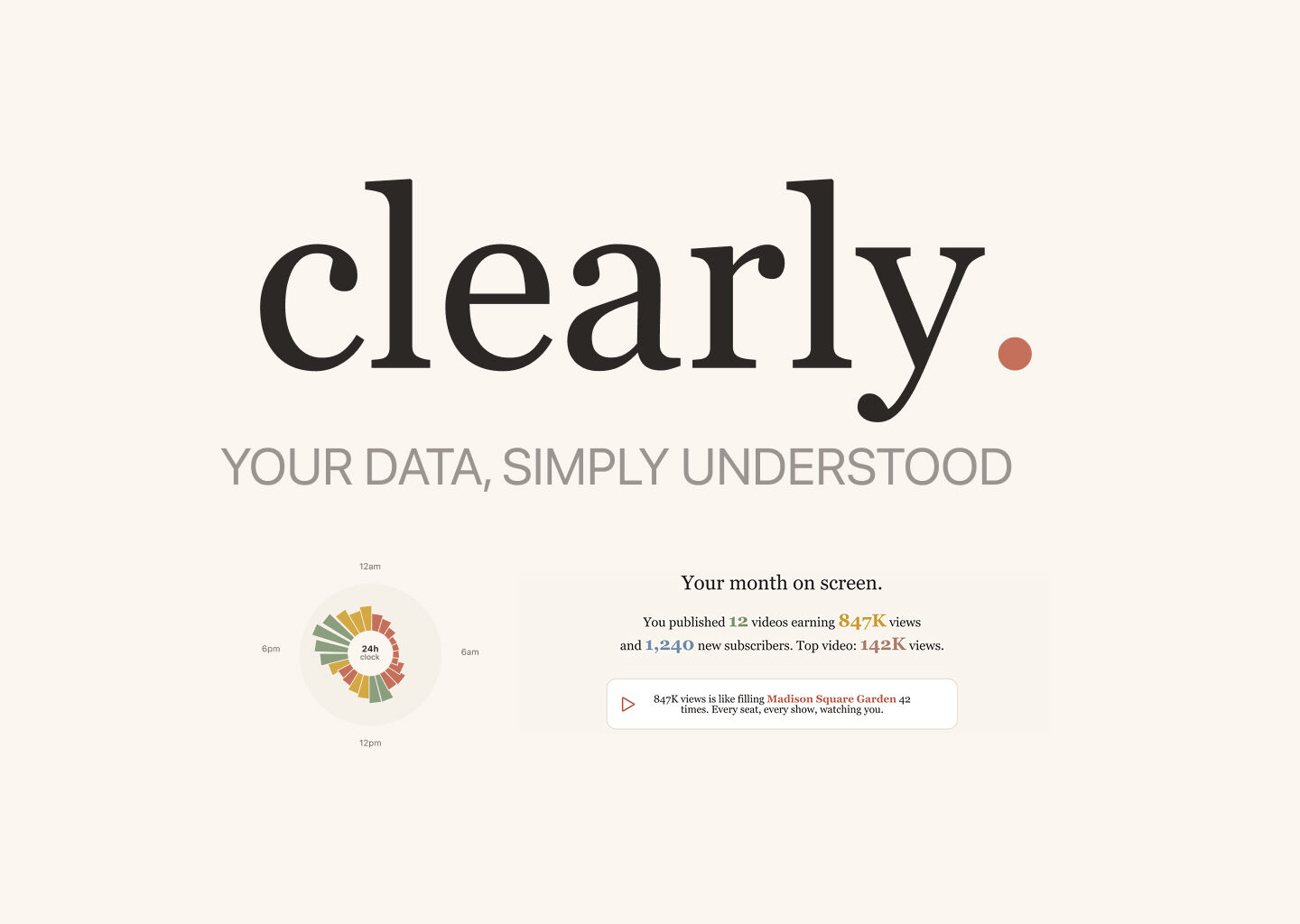
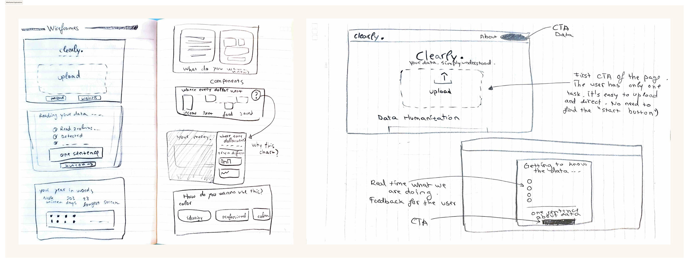
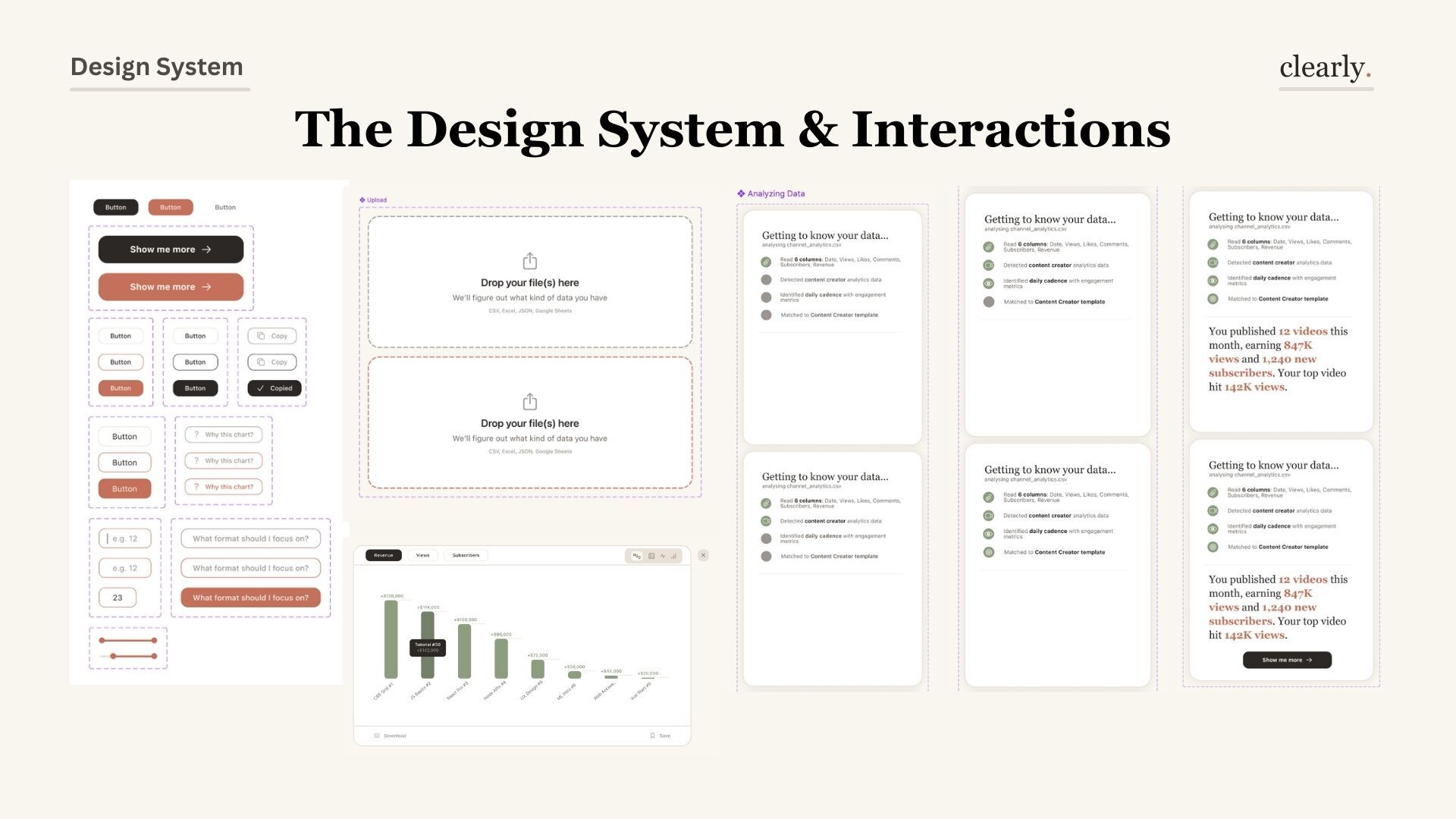
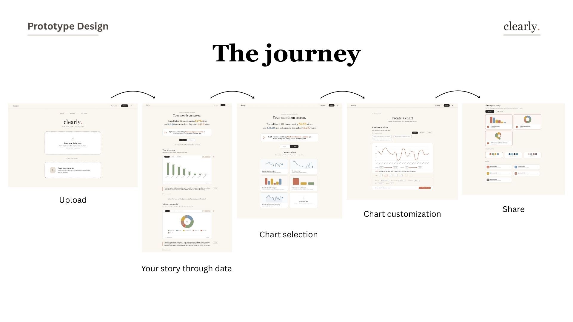
Clearly is a web application designed to make data analysis genuinely accessible. Instead of confronting users with an empty chart canvas, it walks them through a conversation: upload your data, get to know it, ask what you want to understand — then create a chart that knows what it means.

01 — Problem

data is everywhere. understanding it isn't.

Who needs this and why — 4 user personas
Research — who needs this and why: freelancers, founders, ops managers, PhD students
Problem statement
Problem statement — the confidence gap between having data and understanding it

Tools assume expertise

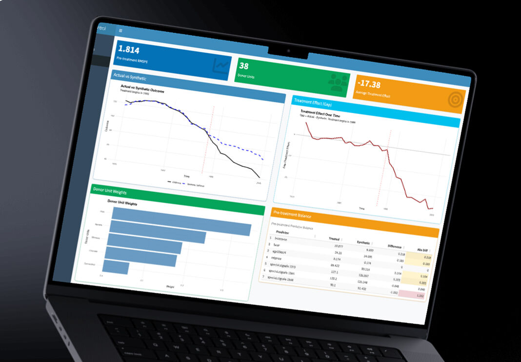
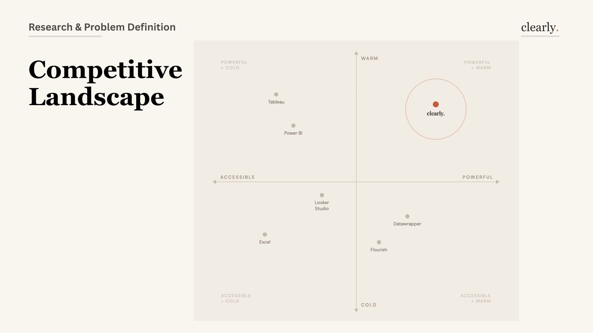
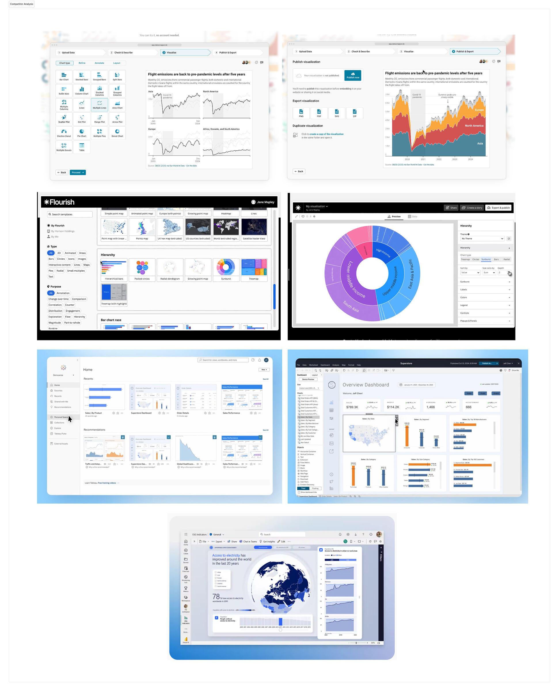
Tableau, Power BI, Datawrapper — all confront users with an empty canvas. They're powerful but expect you to already know what question you're asking.

The fear of being wrong in public

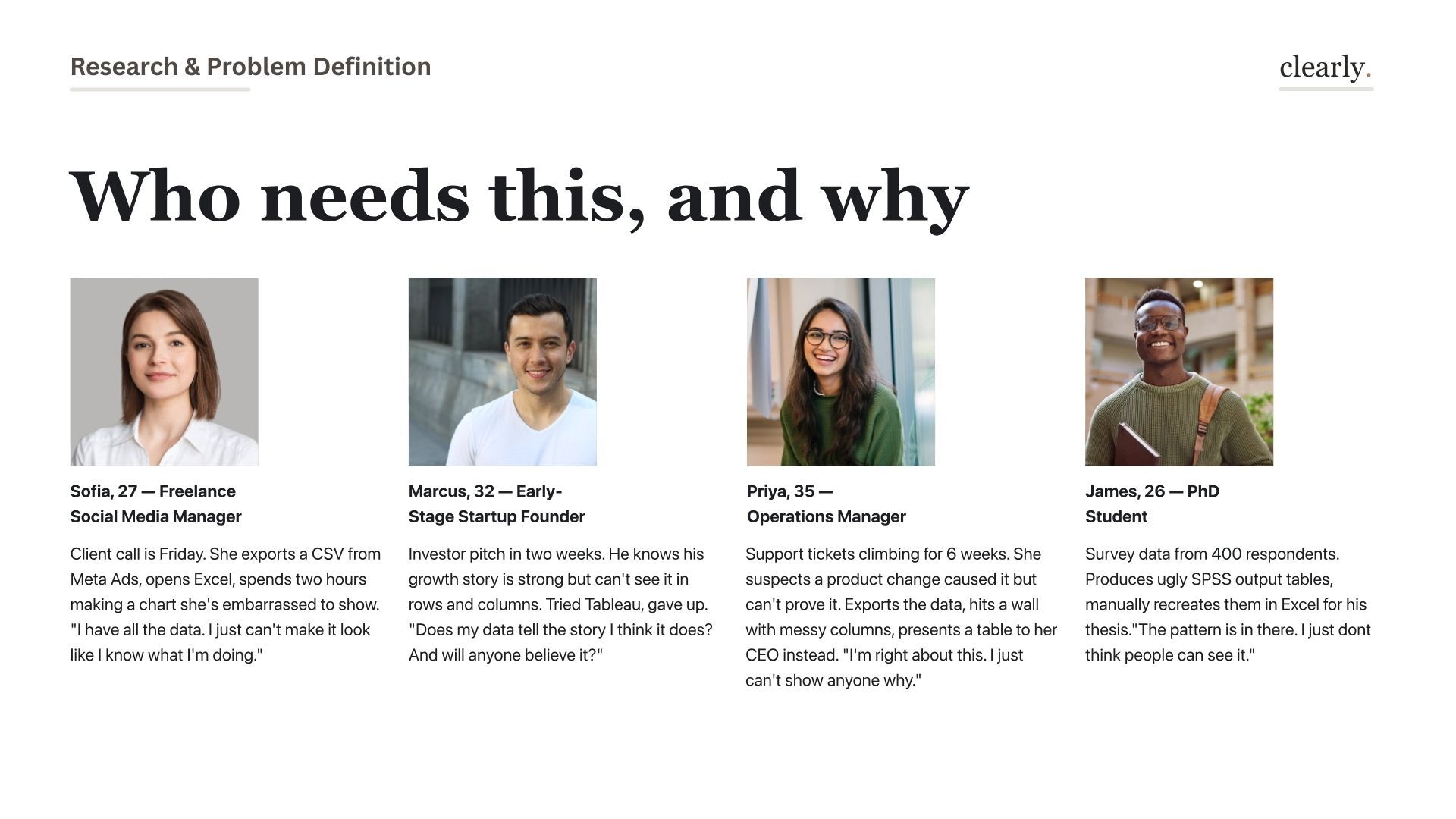
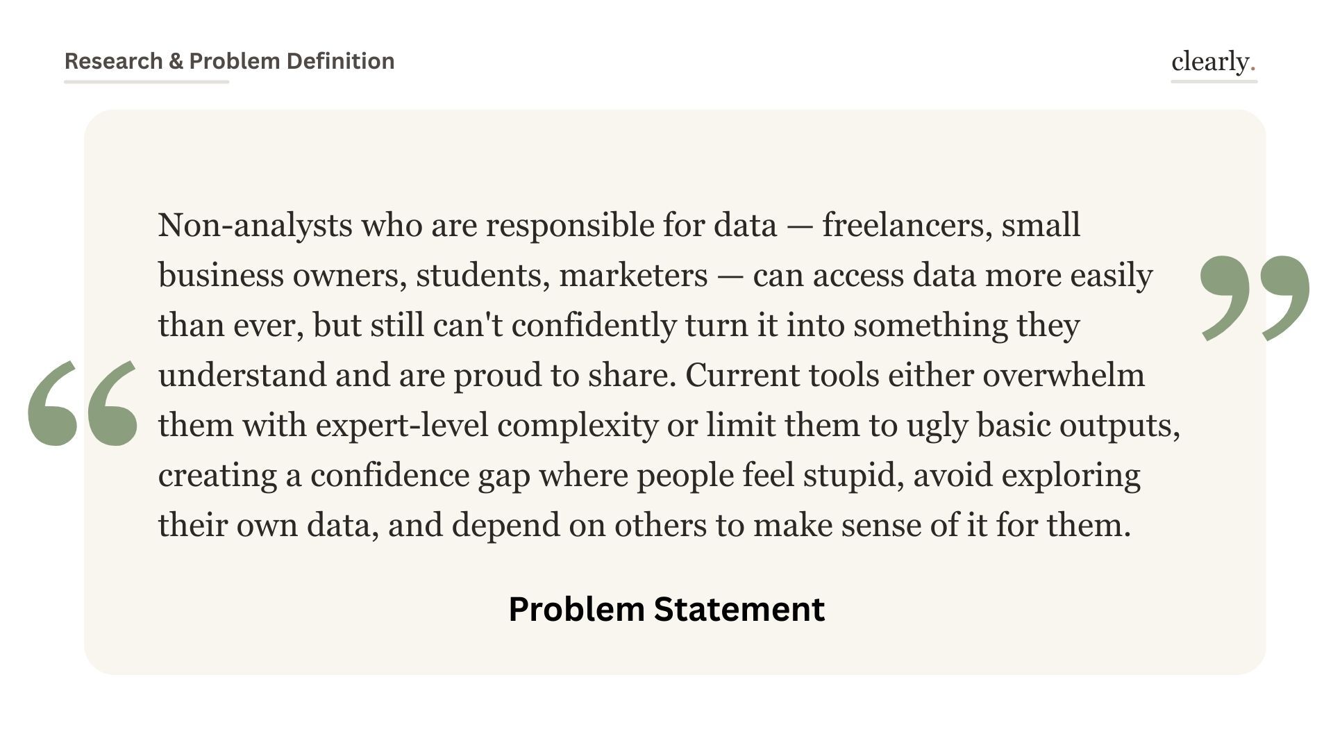
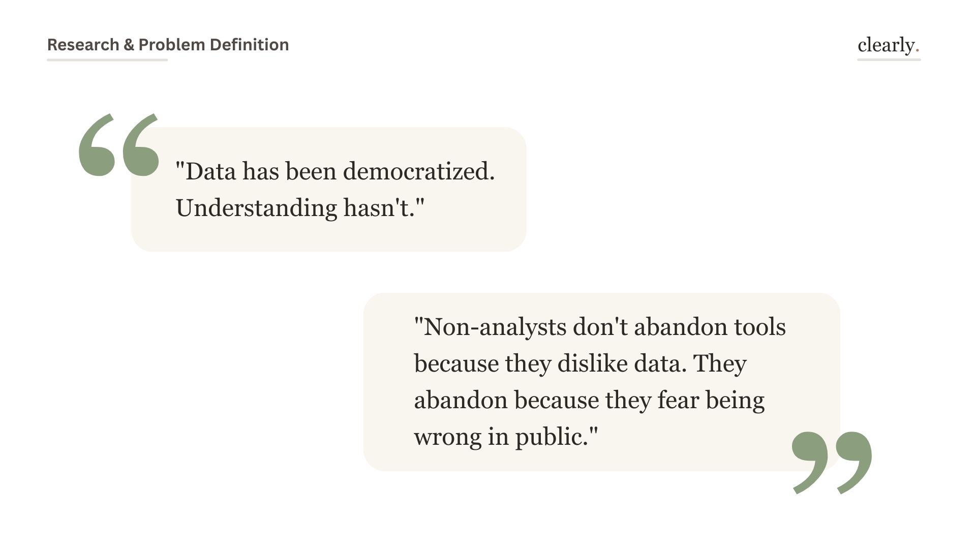
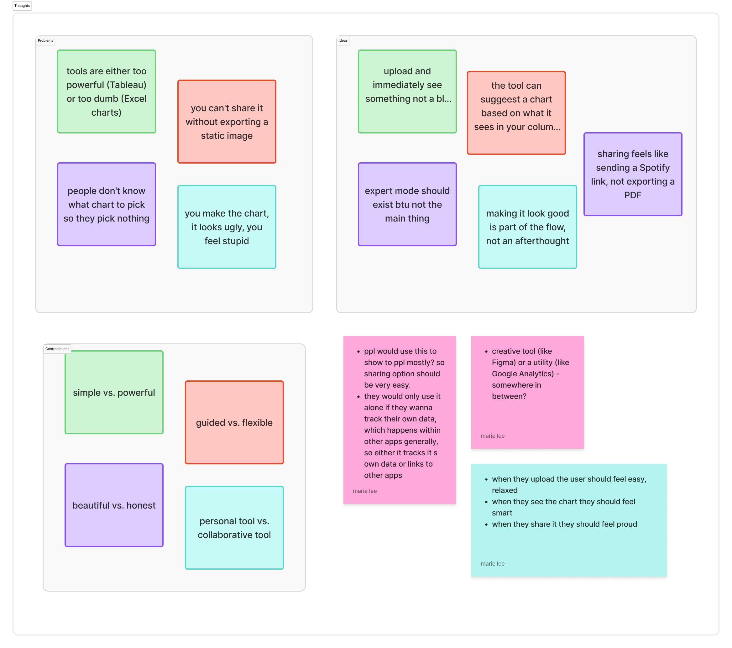
Non-analysts don't abandon data tools because they dislike data. They abandon because they fear picking the wrong chart and looking foolish.

Research quotes about data democratization
"Data has been democratized. Understanding hasn't." — the core tension driving the design
02 — Research

from use cases to competitive positioning

Main use cases: show, understand, track
3 main use cases — the jobs users actually need done
three real reasons people reach for data tools

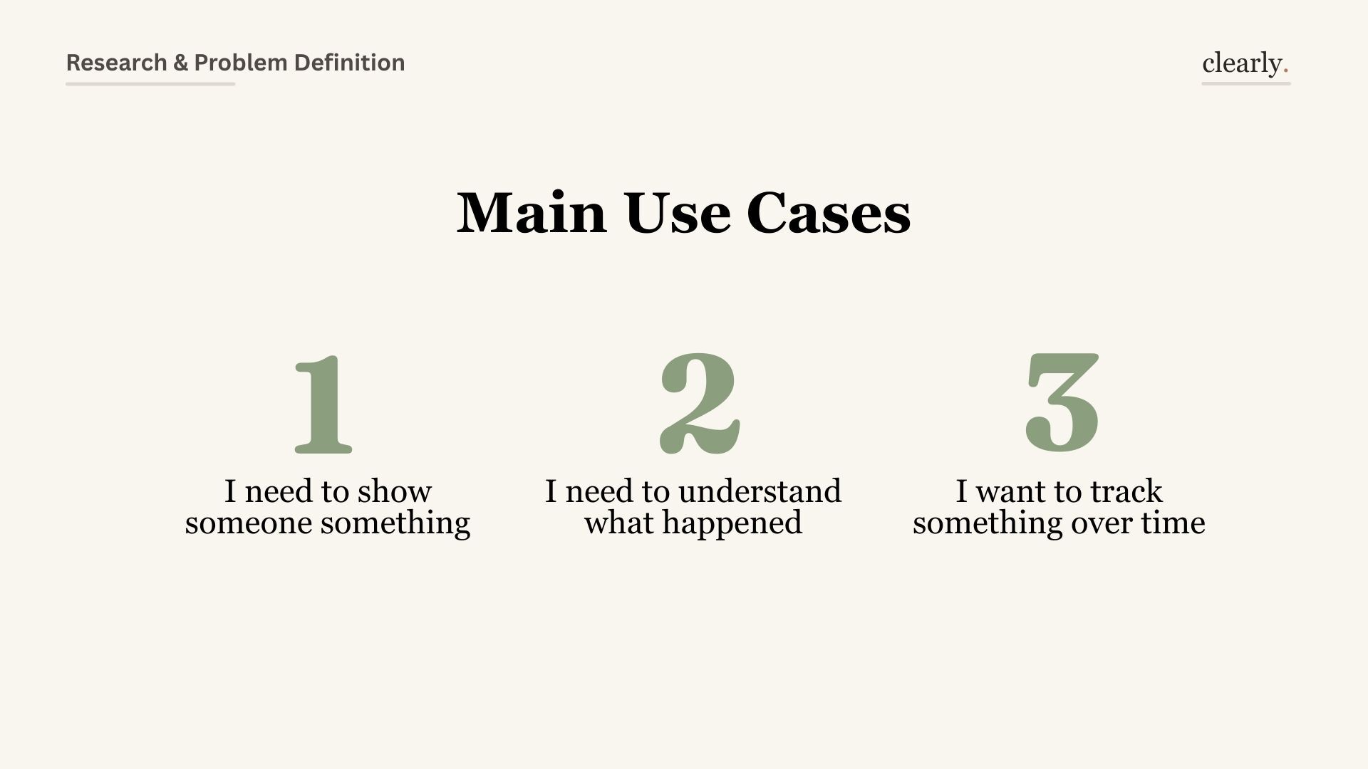
The research surfaced three distinct modes: people who need to show someone something, people who need to understand what just happened, and people tracking a metric over time. Each needs a different kind of guidance — Clearly is designed to detect which mode you're in and adapt.

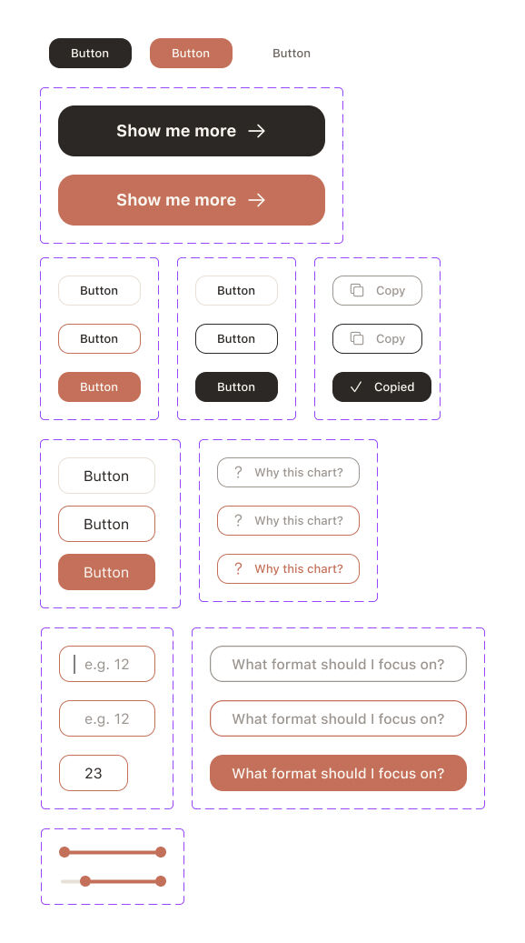
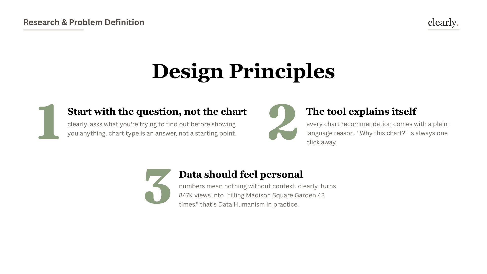
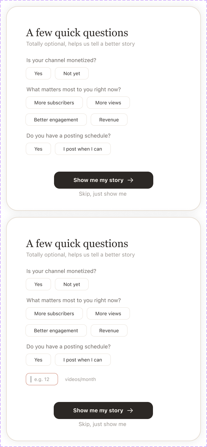
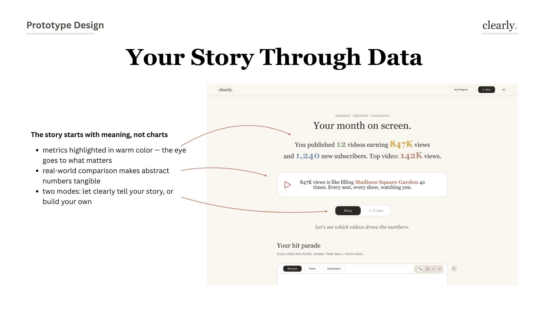
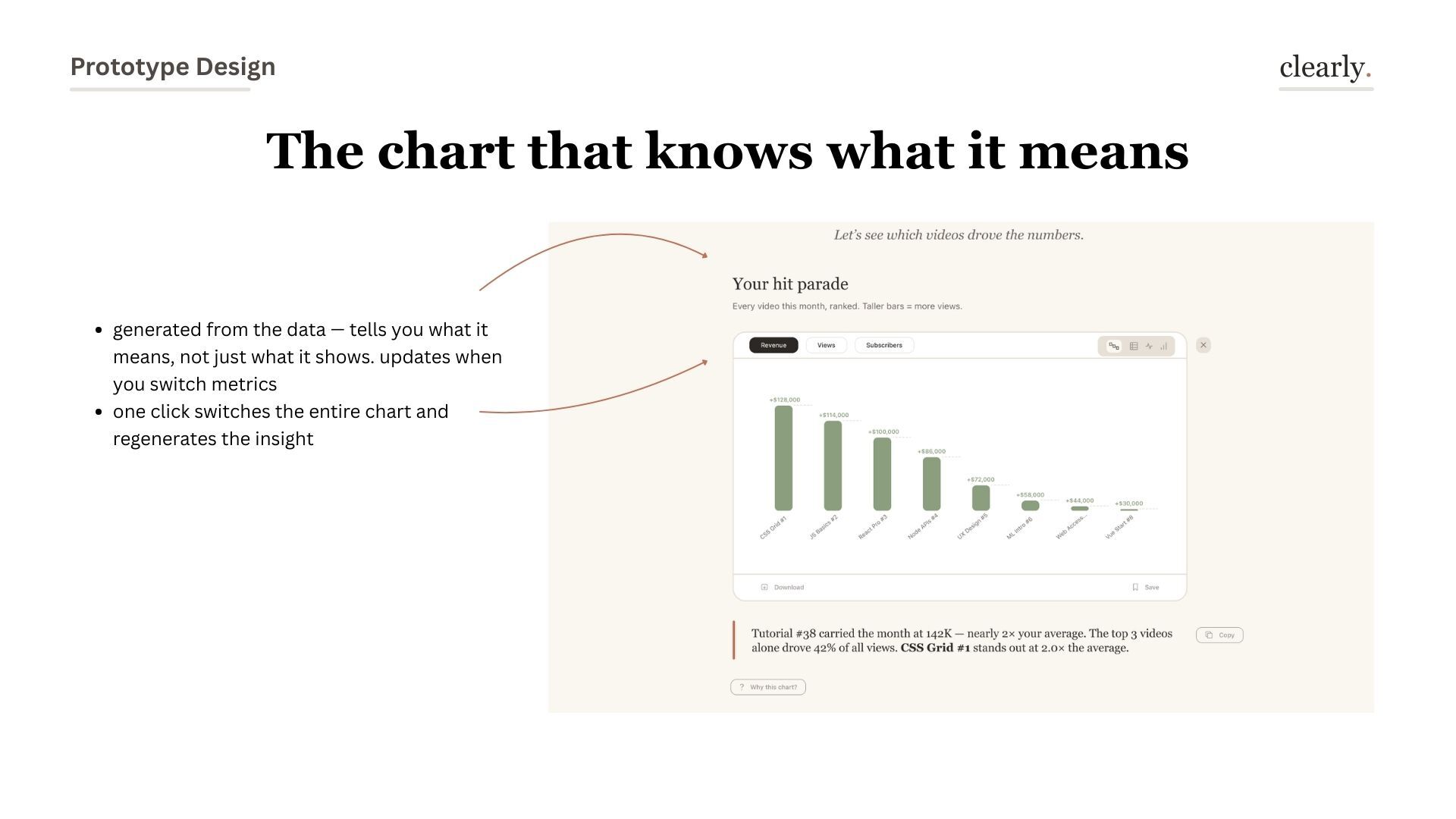
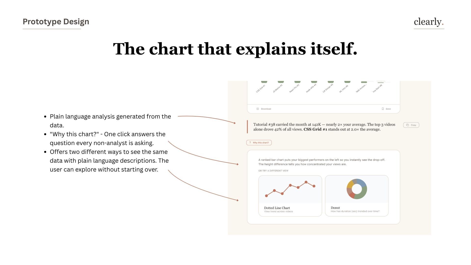
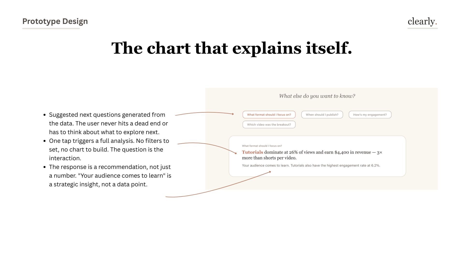
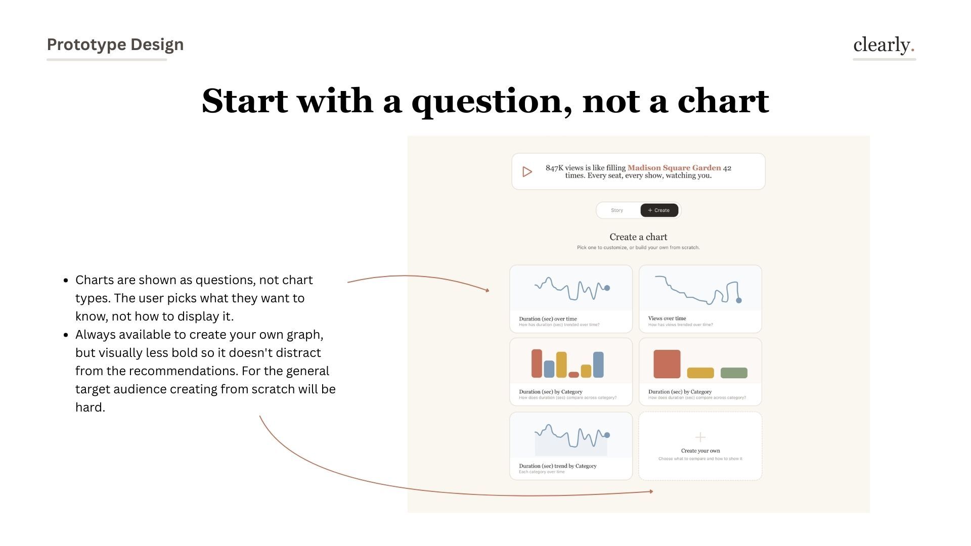
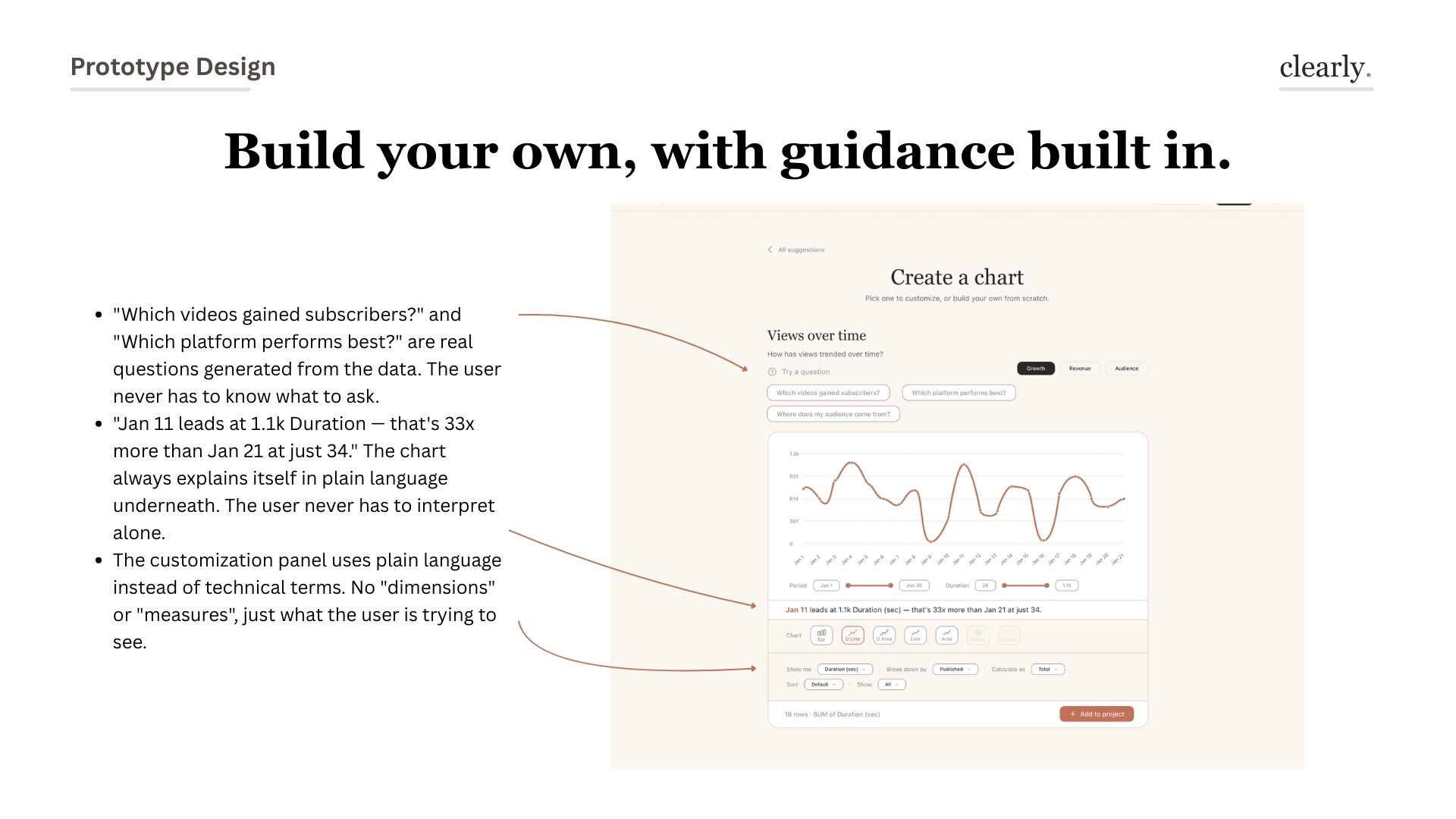
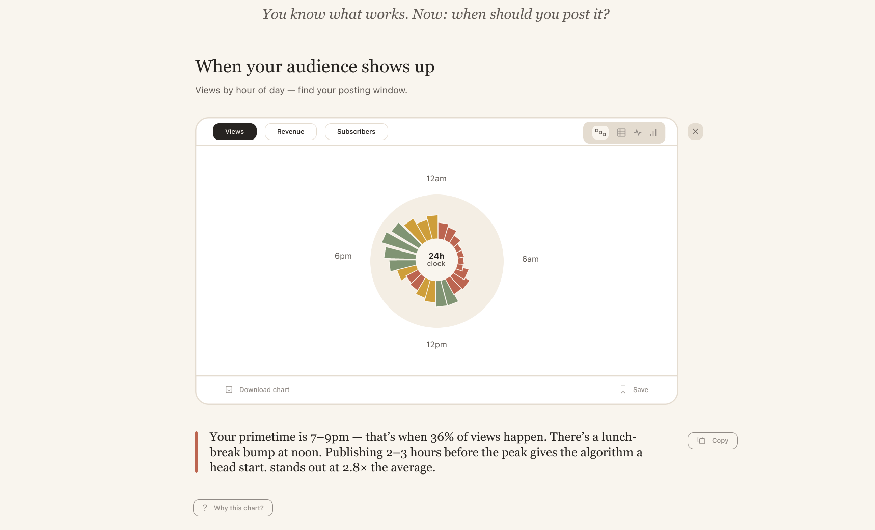
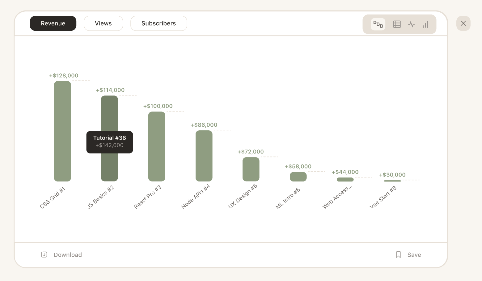
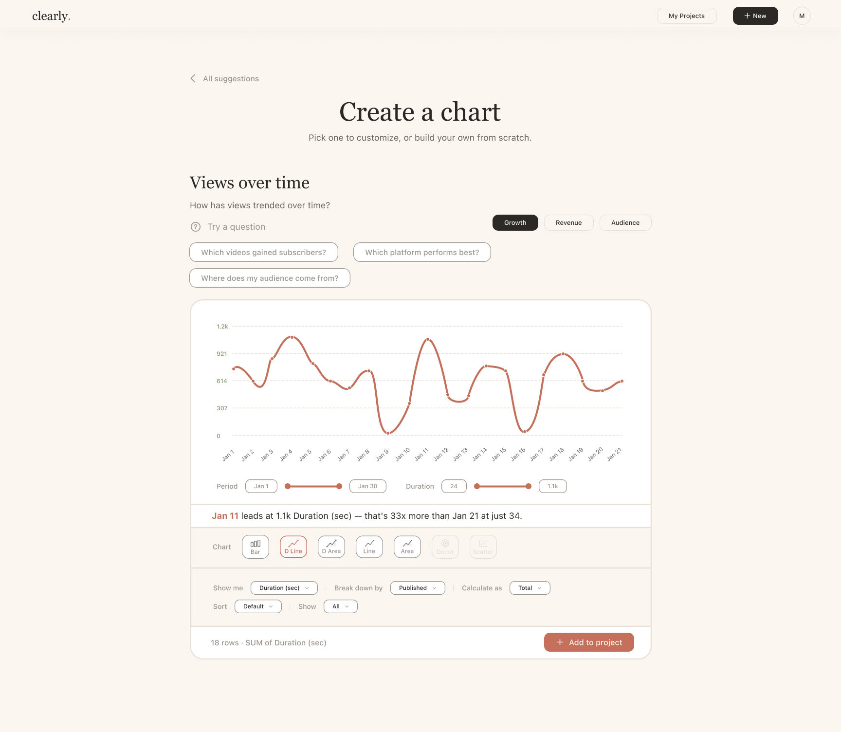
Design decision: Don't ask users to pick a chart type. Ask what they need to understand. The chart type is an answer, not a starting point.

Competitive landscape positioning quadrant
Competitive positioning — Clearly sits in the "Powerful + Warm" quadrant, unoccupied by any existing tool
Competitor deep-dive analysis
Competitor deep-dive — Tableau, Datawrapper, Observable, Flourish
Wide paper ideation session
Paper ideation — sketching the full flow across a long session before touching Figma
Paper wireframe explorations
Paper wireframes — information architecture explorations, 3 different structural approaches
Whiteboard brainstorm
Whiteboard — mapping the problem space, user mental models, and design directions
Insight 01

Questions before charts

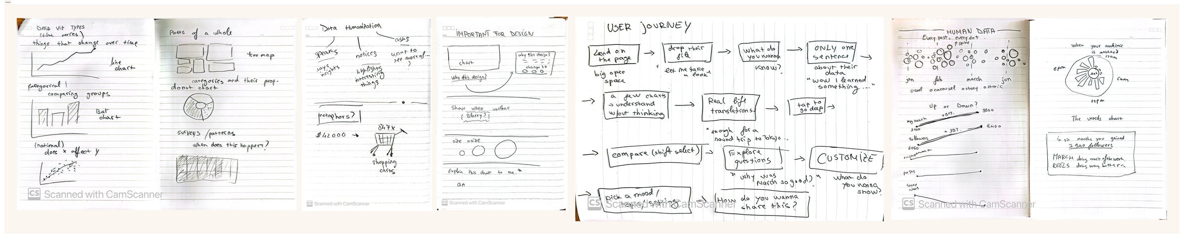
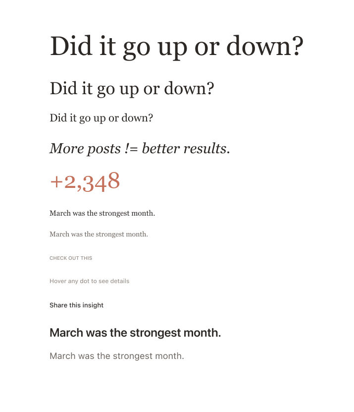
Every visualization is an answer to a question. The tool should surface the question first, and the chart will almost pick itself.

Insight 02

The "warm + powerful" gap

No tool occupies the top-right quadrant: powerful enough to be useful, warm enough to feel safe. That's the entire Clearly positioning.

Insight 03

Trust is built progressively

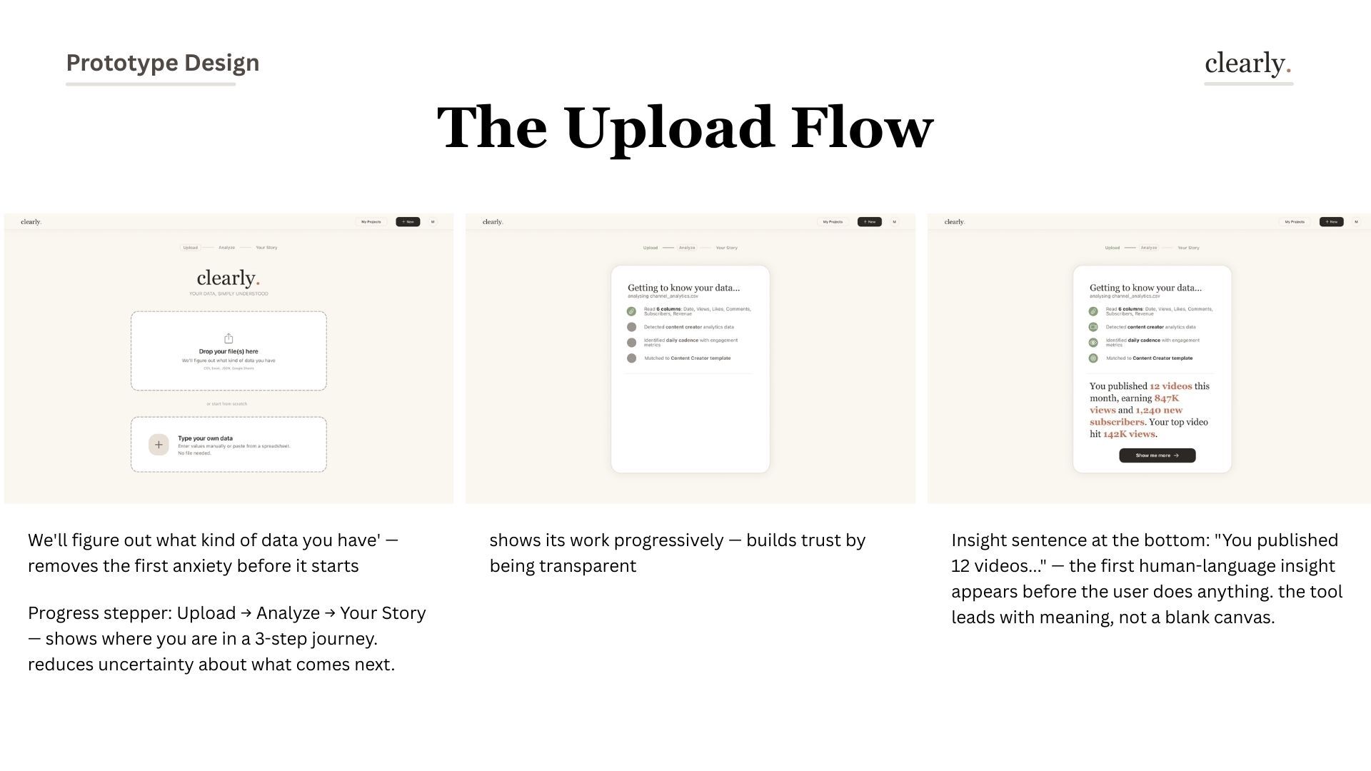
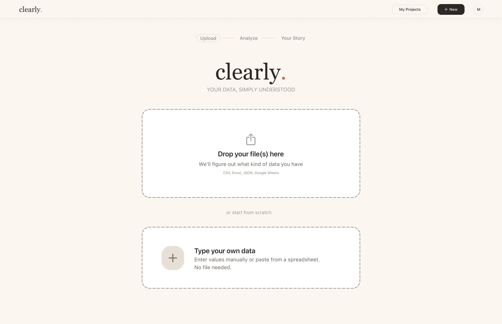
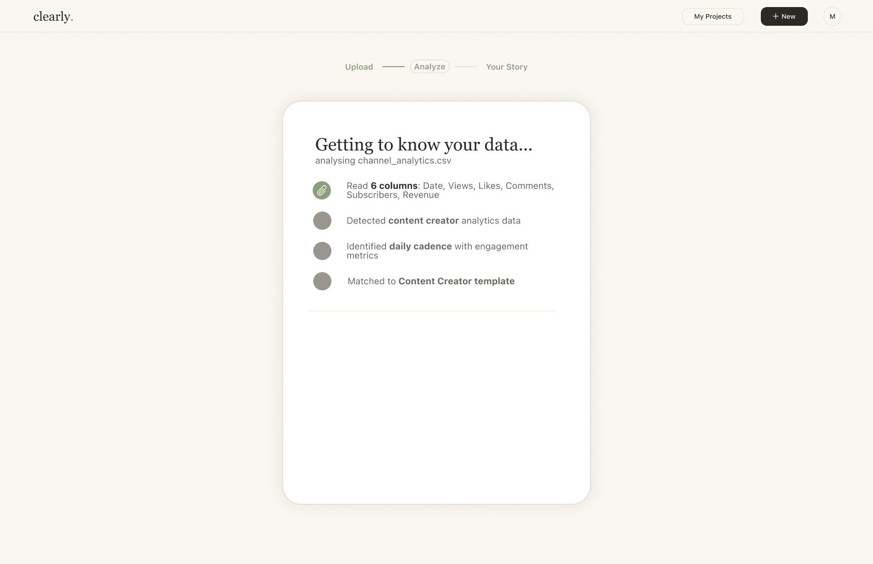
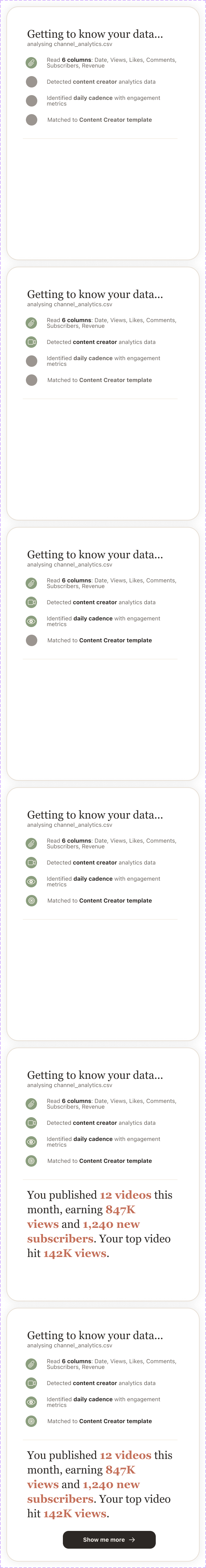
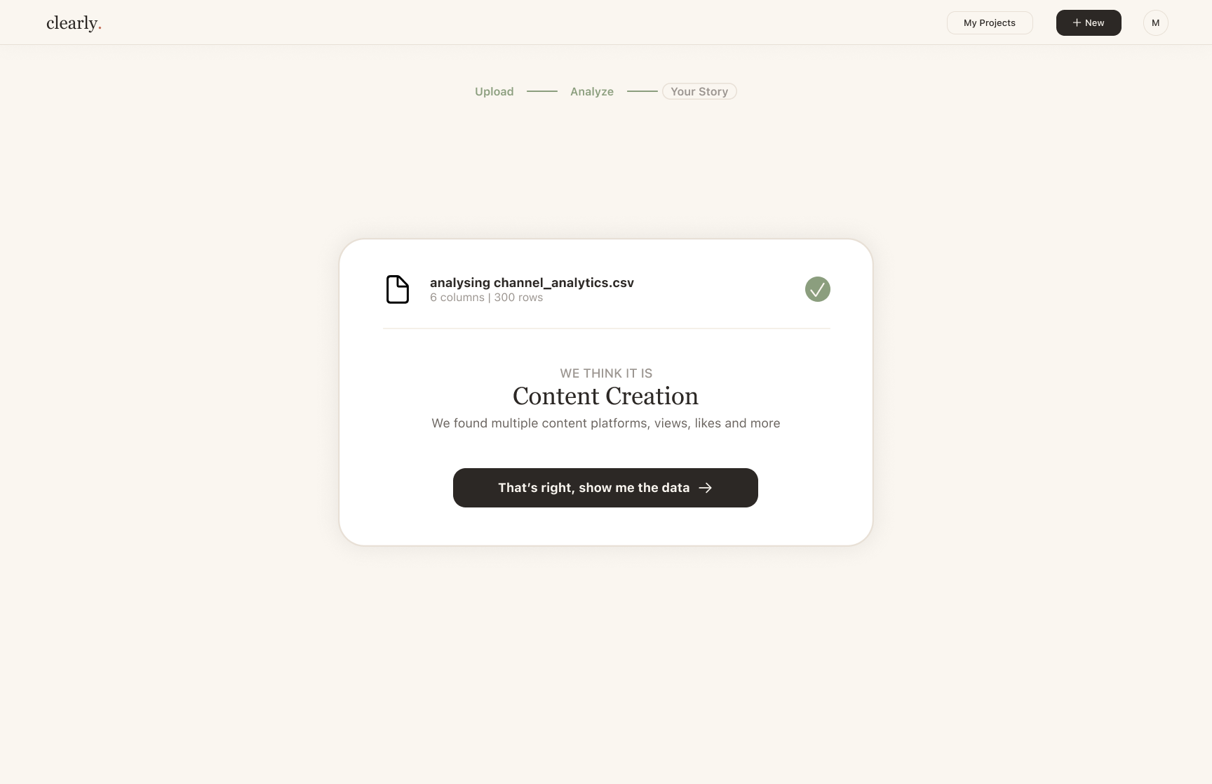
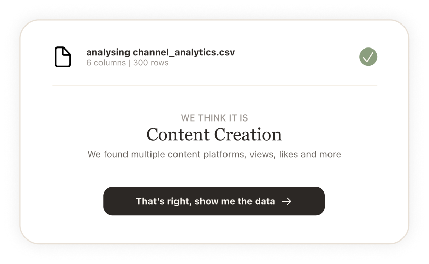
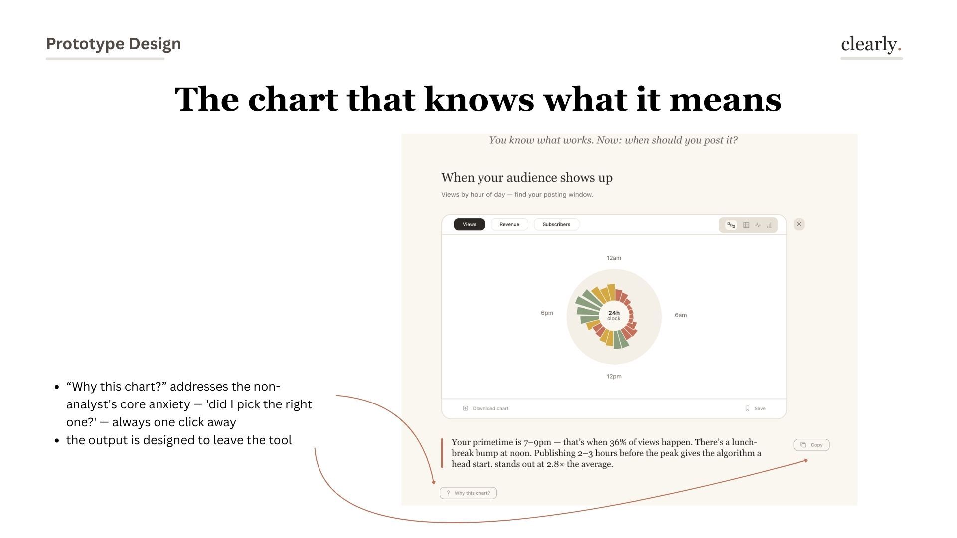
Users don't trust a tool that knows too much. They trust one that shows its work — "we detected 6 columns" builds more confidence than a magic import.

03 — Design System

warm, not cold. cozy, not clinical.

Georgia for warmth. System-ui for clarity.

Terra cotta, sage, cream — nothing neon, nothing aggressive. Serif for everything human (headlines, insights, body). Sans-serif for everything functional (labels, buttons, captions). The design language had to make data feel approachable, not intimidating.

Design System and Interactions overview
Design system overview — buttons, upload states, data panels, interaction states
Clearly logo on white
Clearly logo on dark
Typography system
Typography — Georgia + System-ui scale
Button system
Buttons — primary, secondary, ghost, copied state
Active button states in terracotta
Active states — terracotta highlights selected choices at a glance
Icon library
Icon library — custom icons for data interactions
Design Principles
Design principles — start with the question, the tool explains itself, data should feel personal
04 — Solution

a guided data conversation

five steps from confusion to clarity

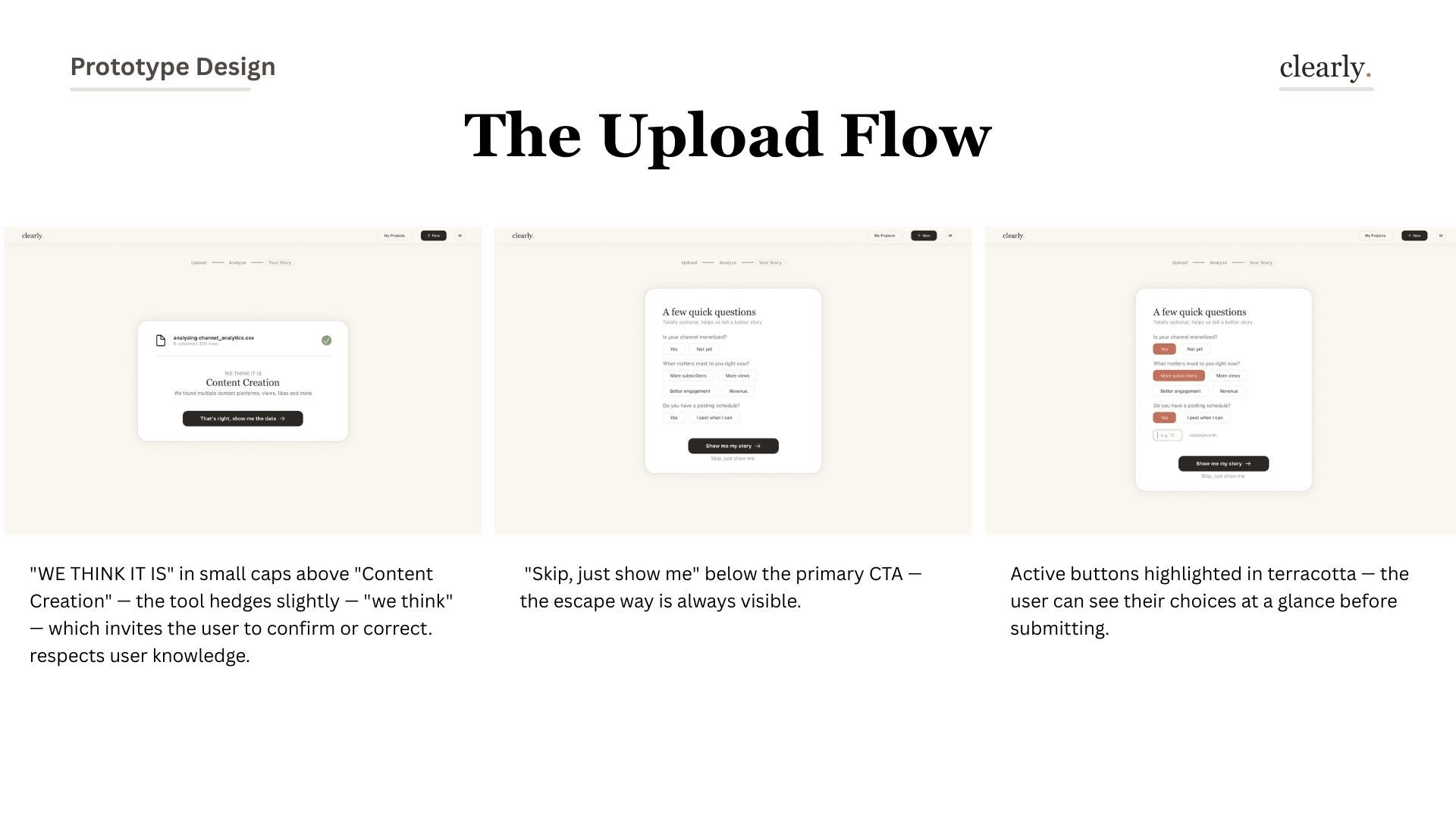
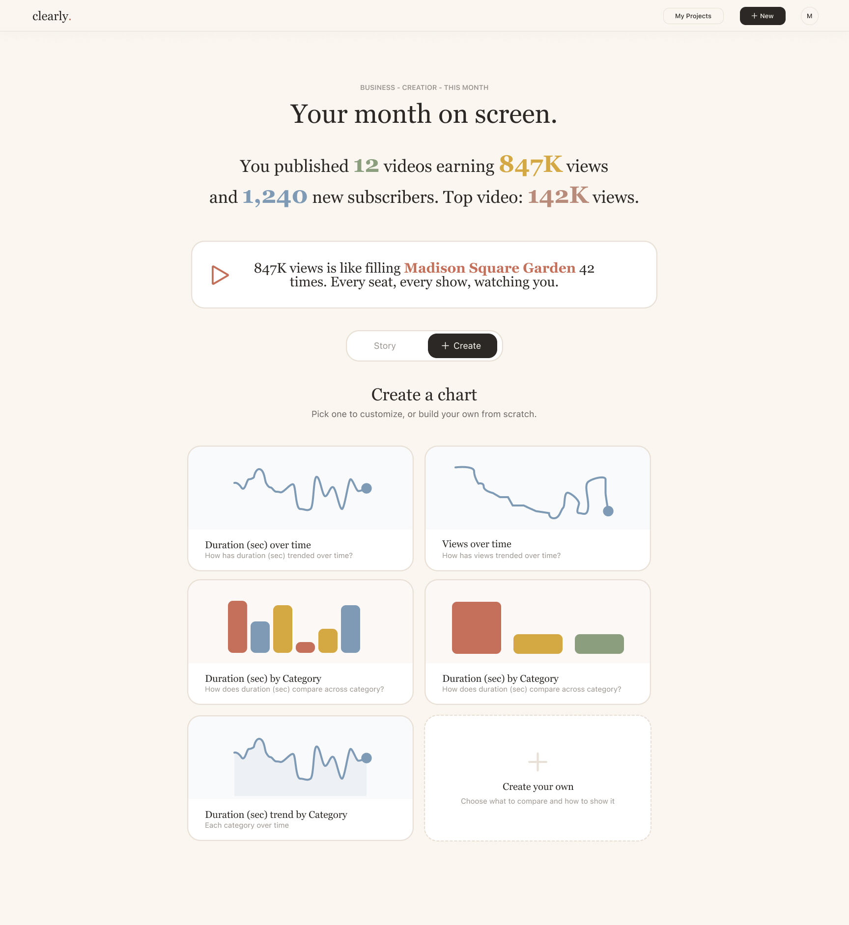
Clearly doesn't ask users to choose a chart type. It walks them through a conversation: upload, get to know, ask questions, interpret, then visualize. Each step builds understanding before demanding any decision.
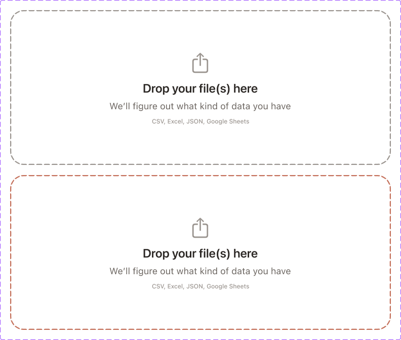
1
Upload

Drop in any file

2
Get to Know It

Data introduces itself

3
Ask Questions

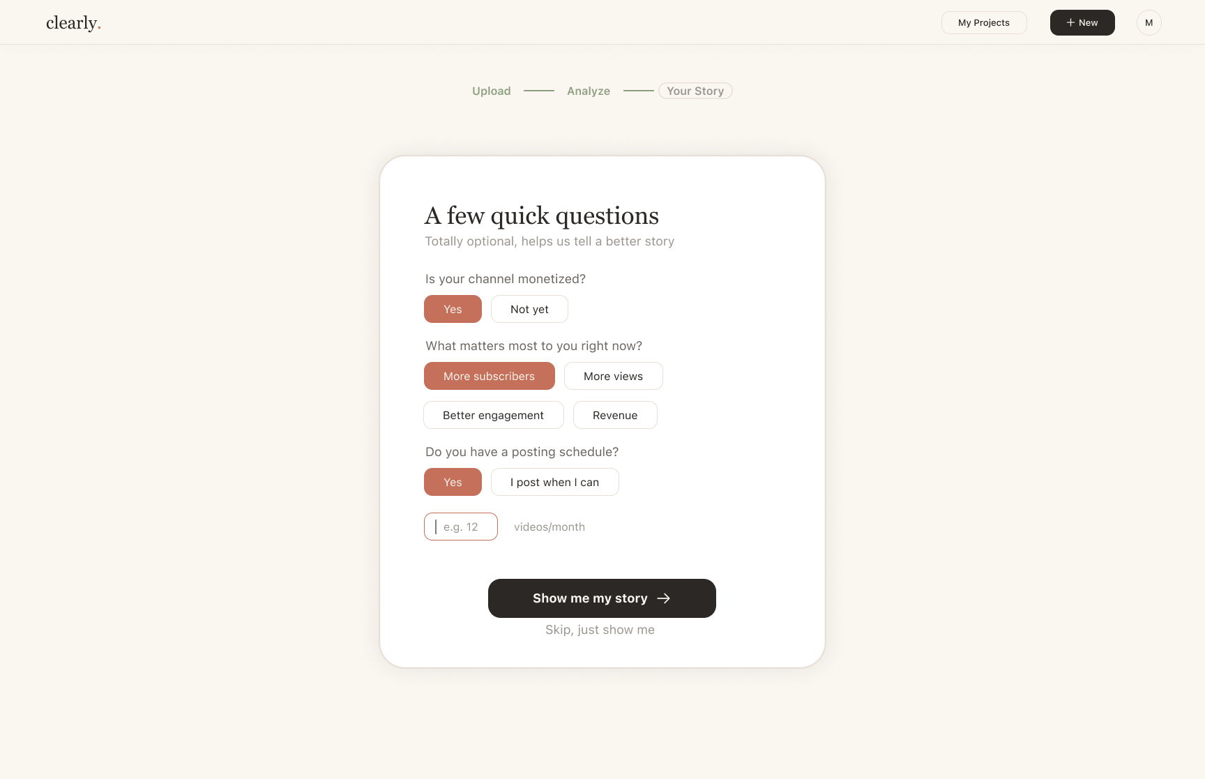
What do you want to know?

4
Your Story

Meaning before charts

5
Visualize

Chart that explains itself

The journey — full flow overview
The full journey — Upload → Your Story → Chart Selection → Customization → Share
Step 01
Upload — drop it in, we figure out the rest
Upload flow annotated with design decisions
Upload flow — annotated: progress stepper reduces uncertainty, transparent analysis builds trust, first insight appears immediately
Upload screen hi-fi
Upload screen — calm, uncluttered. Drop a file or type data manually
Upload component
Upload component — designed for confidence, not friction
Step 02 — 03
Getting to Know Your Data + A Few Quick Questions
WE THINK IT IS + questions flow annotated
Annotated — "WE THINK IT IS" hedges politely, "Skip, just show me" is always visible, active terracotta shows selections at a glance
Getting to know the data screen
Data overview — columns, types, patterns surfaced before you ask for anything
Questions screen
Quick questions — optional context that helps Clearly tell a better story
Data analysis component — scroll to see full
Analysis panel — scroll ↕ to see the full component
Questions component
Questions component — natural language meets structure
Step 04
Your Story Through Data — meaning before charts
Your story through data — annotated with arrows
Annotated — warm color highlights what matters, real-world comparison makes abstract numbers tangible, two modes: Story or Create
What we think the data is
"Here's what we see in your data — does this match?" — shared understanding before the chart
Data interpretation component
Interpretation component — the tool makes a claim, you validate or correct it
Step 05
The Chart That Knows What It Means
The chart that knows what it means — annotated bar chart
Annotated — generated plain-language insight updates when you switch metrics, one click regenerates everything
Radial chart — when your audience shows up
Annotated — "Why this chart?" addresses the non-analyst's core anxiety. The output is designed to leave the tool
The chart that explains itself — alternative views
Alternative views — plain language, "why this chart?", two different ways to see the same data
Suggested next questions from the data
Suggested questions — one tap triggers a full analysis. The question is the interaction
Start with a question, not a chart
Charts as questions — users pick what they want to know, not which chart type to use
Build your own, with guidance built in
Custom chart builder — plain language instead of "dimensions" or "measures". The chart always explains itself underneath
First hi-fi chart
"The chart that knows what it means" — variant one
Second hi-fi chart
"The chart that knows what it means" — variant two
The chart that explains itself
The chart that explains itself — insights embedded in the visualization
Interactive graph
Interactive graph — hover to reveal context and comparison
Create a chart main page
Chart creation — Clearly recommends chart types as questions, not technical formats
Graph customization
Customization — granular controls available but never forced on the first-time user
05 — Full Presentation

the complete deck

All 21 slides from the Revolut Design Task submission. Click any slide to view full size.

Slide 1 — Cover Slide 2 — Who needs this Slide 3 — Problem statement Slide 4 — Main use cases Slide 5 — Research quotes Slide 6 — Design principles Slide 7 — Competitive landscape Slide 8 — The journey Slide 9 — Upload flow Slide 10 — Upload flow continued Slide 11 — Your story through data Slide 12 — The chart that knows what it means Slide 13 — Radial chart Slide 14 — The chart that explains itself Slide 15 — Suggested questions Slide 16 — Start with a question Slide 17 — Build your own Slide 18 — Design system Slide 19 — If I had more time Slide 20 — What I learned Slide 21 — Thank you
06 — Reflection

designing data is different from displaying it

If I had more time — 4 next steps
If I had more time — hover tooltips, error states for messy data, mobile export, My Projects dashboard
what I'd do next

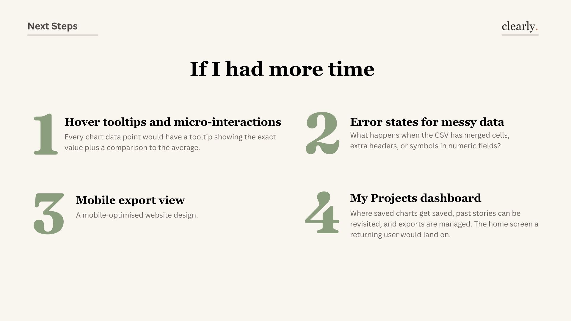
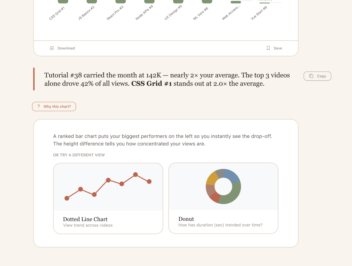
Every data interaction reveals a new edge case. Messy CSVs with merged cells, error states that don't make users feel stupid, hover tooltips that explain each bar — these are the details that turn a prototype into a product.

What I learned — designing data is different from displaying it
What I learned — shifting from "does the chart render?" to "does the chart feel human?" changed everything
Lesson 01

Questions before charts

Every visualization is an answer to a question. Design the question step first, and the visualization almost designs itself.

Lesson 02

Warmth in technical tools matters

Terra cotta in a data tool felt counterintuitive. But emotional safety and technical precision aren't opposites — warm design makes users confident enough to explore.

Lesson 03

Sequencing is the real design problem

The order in which a user encounters information completely changes how they understand it. Interpretation before visualization isn't just UX — it's a philosophy.

"Data tools are often designed for experts who already understand data. Clearly was an exercise in designing for the moment just before understanding — when someone looks at a spreadsheet and thinks 'I have no idea what this is telling me.' That's the most important moment to get right."
— Clearly, 2026
← → navigate · Esc close